
Colour psychology is the scientific study of how colours shape human emotions, behaviour, and decision-making. It draws on biology, neuroscience, and cultural context to explain why a hospital painted sage green feels calmer than one painted white, or why a red “Buy Now” button outperforms a grey one. The role of colour psychology reaches far beyond aesthetics. It operates on a subconscious level, influencing how you feel in a room, whether you trust a brand, and even how quickly you act on an impulse.
Here is what the research confirms:
- Colour influences emotions through both physiological responses (heart rate, arousal) and learned cultural associations.
- Light colours consistently link to positive emotions; warm colours like red and orange trigger high-arousal states.
- Universal patterns exist across cultures, but geography, language, and personal experience all modulate the response.
- Saturation and lightness often have more emotional impact than hue alone.
- Applied thoughtfully, colour becomes one of the most powerful tools in design, branding, and wellbeing.
What are the theoretical foundations of colour psychology?
The study of colour’s psychological effects has roots stretching back to ancient Greece. Aristotle believed all colour derived from mixtures of white and black. That view held until 1666, when Sir Isaac Newton used a prism to demonstrate that white light contains the full visible spectrum, from red at 700nm to violet at 400nm. The difference in wavelength is not just optical. Longer wavelengths at the red end are felt as warmth; shorter wavelengths at the violet end register as cooler. This physical reality underpins the “warm” and “cool” colour distinction that still shapes design practice today.
Modern theoretical frameworks have moved well beyond Newton. Contemporary models organise colour responses along three psychological dimensions: arousal (how stimulating a colour feels), valence (whether the emotional response is positive or negative), and power (the sense of dominance or submission a colour conveys). These dimensions map onto colour properties in consistent ways. Warm, saturated colours like red and orange tend to score high on arousal and power. Cool, desaturated colours like soft blue and lavender score lower on arousal but often higher on positive valence in relaxed contexts.
A key insight from recent research is that hue alone does not determine emotional meaning. A review of 132 studies found that saturation and lightness are equally, if not more, influential in shaping emotional responses than hue. A highly saturated red and a muted dusty rose carry very different emotional charges, even though both are technically “red.” This challenges the simplistic colour-meaning charts that still circulate in popular design guides.
Early physiological research, including Kurt Goldstein’s mid-20th-century experiments linking red to changes in motor function, helped establish that colour could produce measurable bodily responses. Those specific findings were never robustly replicated and are now considered historically interesting rather than clinically valid. What they did do was open the door to the neurophysiological research that followed, which has since placed colour psychology on far firmer scientific ground.
What does the empirical research say about colour and psychological functioning?
The evidence base for colour psychology has grown considerably in recent decades, moving from anecdote and small-scale experiments to large-scale, cross-cultural studies.
One of the most compelling findings comes from a study drawing on 128 years of data covering 42,266 participants worldwide. The universal similarity coefficient for colour-emotion associations was 0.88, indicating strong cross-cultural agreement. Light colours consistently linked to positive emotions; red linked to high-arousal states and power; yellow and orange linked to high-arousal happiness. The patterns held across vastly different linguistic and geographic contexts, though local culture did modulate the strength of specific associations.
At the neurophysiological level, a 2025 study examined how combining colour hue with illuminance levels predicts emotional responses. The results were striking: the combination predicted emotional valence with 87% accuracy and arousal with 79% accuracy across 18 lighting conditions. That kind of predictive power gives designers and architects a genuinely scientific basis for adaptive colour environments, rather than relying on intuition alone.
| Study focus | Key finding | Accuracy / coefficient |
|---|---|---|
| Cross-cultural colour-emotion associations | Universal patterns confirmed across 42,266 participants | Similarity coefficient: 0.88 |
| Colour hue + illuminance on emotional valence | Combined hue and light level predicts emotional valence | 87% accuracy |
| Colour hue + illuminance on arousal | Combined hue and light level predicts arousal state | 79% accuracy |
| Saturation, lightness, and hue | All three properties drive emotional responses | Confirmed across 132 studies |
Research on cognitive performance tells a more nuanced story. Red, for instance, may increase reaction times in certain tasks, but it does not universally impair test scores. Meta-analyses on colour priming show that the effect depends heavily on context, the nature of the task, and individual differences. Colour influences cognition indirectly, by shaping arousal and mood, rather than acting as a direct cognitive switch.
Pro Tip: When reviewing colour research, check whether a study measures hue, saturation, or lightness independently. Many older studies conflate these properties, which is why their findings are difficult to replicate.
How do culture and history shape colour associations?
Colour meanings are not invented in a vacuum. They accumulate over centuries of cultural practice, religious symbolism, and environmental context.
Historically, the philosophical conversation about colour began with Aristotle and was transformed by Newton’s prism experiments in the 17th century. Johann Wolfgang von Goethe pushed the discussion further in 1810 with his Theory of Colours, arguing that emotional responses to colour were as important as the physics of light. Goethe’s work was less scientifically rigorous than Newton’s but far more influential on artists, designers, and psychologists who followed.
Cultural geography plays a significant role in how colour meanings develop:
- White signals purity and celebration in many Western cultures, but mourning and death in several East Asian traditions.
- Green represents nature, renewal, and in Islamic tradition, paradise. The Qur’an describes those entering paradise as clothed in fine silk of green and gold.
- Purple has historically signified royalty and wealth in Europe, largely because the dye was extraordinarily expensive to produce before synthetic alternatives arrived in the 19th century.
- Red carries associations with danger and urgency in traffic systems globally, yet in China it represents luck, prosperity, and celebration.
- Black is the dominant colour of mourning in Western cultures, while in others the role shifts to white or specific shades of blue.
A 1982 study at New Mexico State University asked 337 children from grades four to six to associate colours with concepts including hope, anger, and happiness. The results showed that children’s colour associations closely mirrored those of adults, suggesting that cultural colour meanings are absorbed early and reinforced throughout life. Red was the most frequently named colour across all twelve emotional concepts, followed by black, blue, and white.
The evolution of colour in environmental design reflects these cultural shifts. Hospitals in the Victorian era favoured stark white, associating it with cleanliness. By the late 20th century, research into patient recovery had prompted a move toward warmer, nature-inspired palettes, a shift that continues today with the rise of biophilic design.
How do specific colours connect to emotions and behaviours?
Colour-emotion relationships are many-to-many, not one-to-one. A single colour can evoke multiple emotions depending on its saturation, lightness, the surrounding context, and the individual perceiving it. That said, research confirms consistent probabilistic patterns that are useful for designers, marketers, and anyone working with colour intentionally.
- Red triggers high arousal, urgency, and power. Physiologically, exposure to red light increases heart rate, respiration, and blood pressure. In a workplace study, a red office environment was found to increase stimulation and performance, though it also raised tension and anger. Red is the colour most associated with danger, passion, and appetite, which is why it appears so frequently in food and retail branding.
- Blue has the opposite physiological effect, lowering heart rate and blood pressure. It links to trust, calm, and reliability. A blue office environment in the same workplace study was associated with greater relaxation but also with fatigue and, in some cases, low mood.
- Green sits at the intersection of calm and vitality. Its association with nature makes it a natural fit for wellness, sustainability, and health brands. Highly saturated greens feel energising; muted, desaturated greens feel restorative.
- Yellow and orange consistently link to high-arousal happiness and optimism. They are among the most attention-grabbing colours in the spectrum, which is why they appear frequently in call-to-action design and warning signage.
- Purple at low illuminance levels may promote positive emotional states by modulating brain activity, making it relevant for cognitive and wellness environments.
- White links to cleanliness and simplicity but can also feel clinical or cold in excess. Workers in white offices in the Stone and English 1999 workplace study reported more headaches and nausea than those in coloured environments.
Statistic spotlight: A universal similarity coefficient of 0.88 across 42,266 participants confirms that colour-emotion patterns are broadly consistent across cultures, though no colour affects every person identically.
The key limitation here is that these associations are probabilistic, not deterministic. Saturation and lightness shift the emotional register of any hue. A pale, desaturated red reads as nostalgic or gentle; a vivid, high-saturation red reads as urgent and powerful. Context, personal history, and cultural background all shape the final response.
How is colour psychology applied in wellbeing and marketing?
Wellbeing and healthcare environments
Hospitals, therapy spaces, and wellness centres have become some of the most active testing grounds for applied colour psychology. The shift away from clinical white toward biophilic colour palettes inspired by nature, including greens, soft blues, and lavenders, reflects a growing body of evidence that these colours reduce anxiety and support recovery. Lavender in particular has been used in pre-operative waiting areas to lower patient stress, while green corridors in rehabilitation units draw on the restorative associations of natural environments.
The 2025 neurophysiological research on hue and illuminance adds a further layer of precision to this work. Designers can now combine specific hues with calibrated light levels to target particular emotional states, moving from general colour guidelines to genuinely adaptive environments.
Colour in branding and marketing
Colour is one of the fastest signals a brand sends. Research indicates that colour significantly influences purchasing decisions, serving as a primary driver of consumer trust and product appeal. The emotional associations a colour carries become part of the brand’s identity, which is why colour choices in logo design and visual identity deserve far more strategic thought than most businesses give them.
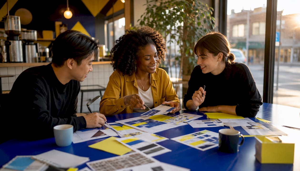
Applied colour psychology in marketing and branding shows that bright, high-contrast colours like green and orange on call-to-action buttons encourage immediate psychological action. Consistent use of a colour palette across all brand touchpoints strengthens recognition and builds the kind of familiarity that converts to trust over time. You can explore how this works in practice through Kukoocreative’s guide to brand colour psychology for UK businesses.
Karen Haller’s applied approach
Karen Haller, a leading applied colour psychology specialist based in the UK, has developed a framework that goes beyond assigning fixed meanings to individual colours. Her approach focuses on the relationship between a brand’s colour tone and its overall visual language. Misalignment between the two creates a subconscious discomfort in the consumer, even when the individual colour chosen seems appropriate on paper. A wellness brand using a highly saturated, aggressive red, for instance, sends contradictory signals: the colour says energy and urgency while the brand promise says calm and care.
Haller’s insight is that the tone of a colour, its warmth, coolness, brightness, and depth, must align with the brand’s personality and promise. This is a more sophisticated framework than simply choosing “blue for trust” or “green for health,” and it reflects the many-to-many nature of colour-emotion relationships that the research confirms.
Pro Tip: Before choosing brand colours, write down three to five words that describe your brand’s personality. Then test whether the tone and saturation of your chosen palette actually reflects those words, not just the hue.
How do individual differences affect colour responses?
Colour psychology does not operate uniformly across all people. Age, gender, personal history, and cultural background all shape how an individual responds to a given colour, sometimes dramatically.
Age is one of the clearest variables. Children tend to prefer bright, highly saturated colours, which is why toys, educational materials, and children’s media lean heavily on primary colours. As people age, preferences often shift toward more muted, complex palettes. Older adults may also perceive colours differently due to changes in the lens of the eye, which yellows with age and affects the perception of blue and violet tones.
Gender differences in colour preference have been studied extensively, though the findings are more nuanced than popular culture suggests. Research does show some consistent patterns, with women more frequently expressing preferences for tints (colours mixed with white) and men for shades (colours mixed with black), but these patterns are heavily influenced by cultural conditioning rather than biology. In cultures where pink is not coded as feminine, the gender gap in colour preference narrows considerably.
Personal experience creates the most individualised layer of colour response. A colour associated with a traumatic memory can trigger anxiety regardless of its universal associations. Conversely, a colour linked to a positive childhood memory may produce warmth and comfort in contexts where it would otherwise feel neutral. This is why colour psychology should function as a strategic tool informed by context and audience research, not a deterministic formula applied identically to every person.
Cultural background, as explored earlier, adds another layer. The same colour can signal celebration in one culture and mourning in another. For brands operating across multiple markets, this makes audience-specific colour research a practical necessity rather than an optional refinement.
What are the limitations and criticisms of colour psychology research?
Colour psychology has a credibility problem, and it is largely self-inflicted. Decades of oversimplified “colour meaning” charts, pop-psychology articles, and marketing claims built on shaky foundations have made it harder to communicate the genuinely robust findings that do exist.
Several specific criticisms deserve attention:
- Replication failures. Kurt Goldstein’s early experiments linking red to impaired motor function were never robustly replicated. They remained influential for decades despite the lack of supporting evidence, illustrating how early findings can calcify into received wisdom.
- Conflation of colour properties. Many studies test “red” without specifying whether they mean a highly saturated, bright red or a muted, dark red. Since saturation and lightness independently affect emotional responses, conflating them produces inconsistent and often contradictory results across studies.
- Context dependency. The same colour produces different responses depending on the setting, the task, and the individual. A colour that increases arousal in a laboratory may have no measurable effect in a naturalistic environment.
- Publication bias. Studies that find significant colour effects are more likely to be published than those that find no effect, skewing the apparent strength of the evidence base.
- Cultural overgeneralisation. Early colour psychology research drew heavily on Western, educated, industrialised populations. Applying those findings universally, as many popular guides do, is methodologically unsound.
The cross-cultural study covering 42,266 participants is a genuine step forward precisely because it addresses the cultural overgeneralisation problem directly. Its similarity coefficient of 0.88 confirms that universal patterns exist, while also acknowledging that linguistic and geographic factors modulate them. That kind of nuance is what separates credible colour psychology from the oversimplified version.
How does colour psychology shape environmental design?
The built environment is where colour psychology moves from theory to lived experience. Offices, schools, hospitals, retail spaces, and homes all use colour to shape how people feel and behave within them, whether intentionally or not.
Workplace productivity
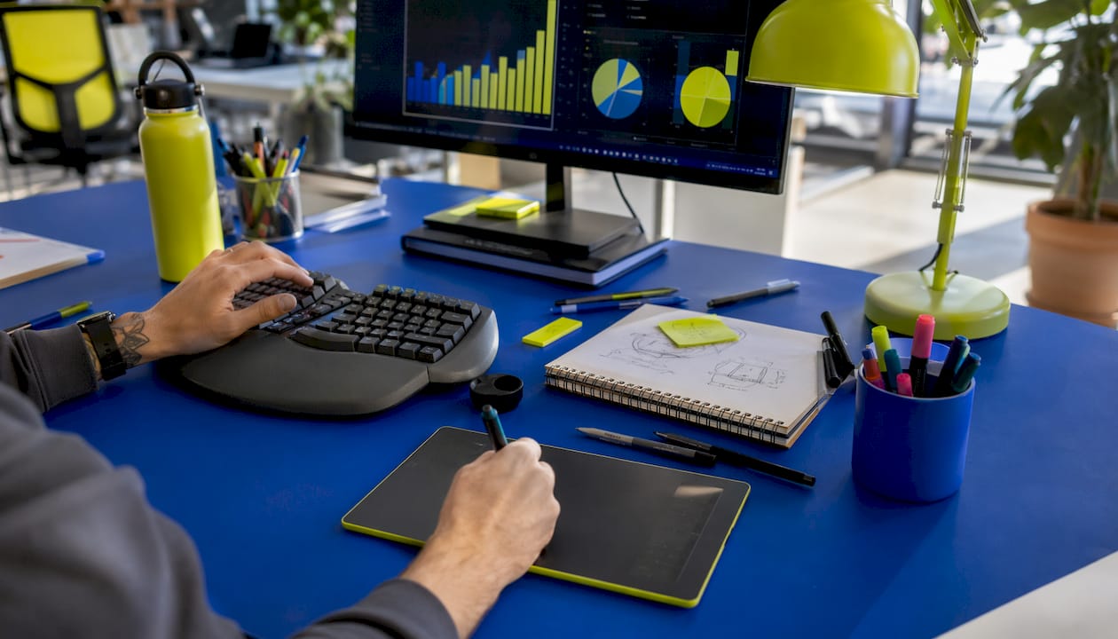
The 1999 Stone and English study on colour in the workplace found that a red office environment increased stimulation and performance but also raised tension. Blue environments promoted relaxation but could tip into fatigue. White offices produced the most complaints, including headaches and nausea. These findings suggest that the most effective workplace colour strategies avoid both extremes, using colour zoning to match the emotional register of a space to its function. A focused, individual work area might benefit from cooler, lower-saturation tones; a collaborative brainstorming space might use warmer, more energising accents.
Healthcare and recovery spaces
As noted earlier, the move toward biophilic palettes in healthcare reflects evidence that nature-inspired colours reduce patient anxiety and support recovery. Green and soft blue tones in clinical environments have become standard in modern hospital design, replacing the stark white of earlier decades. The neurophysiological research on hue and illuminance adds a further dimension: low illuminance combined with certain hues, particularly purple, may promote positive emotional states by modulating brain wave activity, which has direct implications for spaces designed to support rest and cognitive recovery.
Retail and hospitality
Colour in retail environments is designed to influence dwell time, mood, and purchasing behaviour. Warm colours near entrances attract attention and create energy; cooler tones in browsing areas encourage lingering. Restaurants use warm reds and oranges to stimulate appetite and encourage faster table turnover, while fine dining establishments often favour cooler, more muted palettes to signal calm and exclusivity.
Understanding colour theory in design is the foundation for making these choices deliberately rather than by accident.
How does colour psychology influence consumer decision-making?
Colour reaches consumers before words do. In the fraction of a second it takes to form a first impression of a product or brand, colour has already done most of the emotional work.
Research indicates that colour significantly affects purchasing decisions. That figure reflects colour’s role as an emotional signal: it communicates trust, quality, urgency, and personality before a single word is read. A brand that gets its colour right builds an emotional shortcut in the consumer’s mind. One that gets it wrong creates friction, even if the product itself is excellent.
The psychology behind colour in consumer behaviour shows that specific colours perform differently at different stages of the purchasing journey. High-contrast, warm colours like orange and green on call-to-action buttons drive immediate action. Cooler, more authoritative tones like navy and deep grey build the kind of considered trust that supports higher-value purchases. The colour of packaging influences perceived quality: heavier, darker packaging tends to feel more premium, while bright, light packaging signals accessibility and fun.
Consistency matters as much as the initial choice. A brand that uses one colour palette on its website, another on its packaging, and a third in its social media creates cognitive dissonance in the consumer. That dissonance erodes trust, even when the consumer cannot articulate why. Maintaining consistent brand colours across every touchpoint is not a design nicety; it is the mechanism by which colour associations accumulate into genuine brand recognition.
The misalignment problem that Karen Haller identifies operates at this level too. A brand whose colour tone contradicts its visual language sends mixed signals that the consumer registers subconsciously as discomfort. They may not be able to name the problem, but they feel it, and it affects their purchasing decision.
Practical guidelines for using colour psychology effectively
Applying colour psychology well requires moving past the “blue means trust, red means urgency” shorthand and engaging with the actual complexity of how colour works.
Start with your audience, not a colour wheel
The most common mistake is choosing a colour based on its general associations and assuming it will work for every audience. Age, cultural background, and personal experience all shape colour response. Research your specific audience before committing to a palette. A wellness brand targeting older women in the UK will respond to a very different palette than one targeting young men in East Asia.
Prioritise saturation and lightness over hue
Since saturation and lightness drive emotional responses as powerfully as hue, test multiple versions of your chosen colour before finalising it. A muted, warm terracotta and a vivid, bright orange are both “orange,” but they communicate entirely different things. The former feels artisan and grounded; the latter feels energetic and playful.
Align tone with brand personality
Following Karen Haller’s framework, write down the emotional words that define your brand before selecting colours. Then test whether the tone of your palette, not just the hue, reflects those words. A brand that describes itself as “calm, trustworthy, and approachable” needs a palette whose lightness and saturation reinforce those qualities, not just a hue that is conventionally associated with them.
Use colour consistently across all touchpoints
Brand colour consistency across your website, logo, social media, packaging, and printed materials is how colour associations build into recognition. Inconsistency dilutes the emotional signal and slows the process of building trust.
Test in context
Colour looks different on screen than in print, under warm light than under cool light, and against different background colours. Always test your palette in the actual contexts where it will be used. A colour that looks authoritative on a white background may look cold and uninviting against a dark one.
Avoid cultural assumptions
If your brand operates across multiple markets, audit your colour choices against the cultural associations in each market. What signals celebration in one context may signal mourning in another. This is particularly relevant for UK brands expanding into Asian or Middle Eastern markets, where colour symbolism differs significantly from Western conventions.
Pro Tip: Use a small-scale A/B test on call-to-action buttons or email subject line preview images to gather real behavioural data on how your audience responds to specific colours before committing to a full rebrand.
How Kukoocreative can help you put colour psychology to work
Understanding colour psychology is one thing. Translating it into a brand identity that genuinely connects with your audience is another. At Kukoocreative, we have spent over a decade helping business owners across the UK build brands that do exactly that, from logos to full websites, grounded in design principles that go far deeper than picking a favourite colour.
Colour is one of the most powerful tools in your brand’s arsenal, and getting it right from the start saves you from costly rebrands down the line. Whether you are building a brand from scratch or refining an existing identity, our team brings both the creative instinct and the strategic thinking to make your colours work as hard as your business does.
Your logo is often the first thing a potential customer sees. Make sure it tells the right story. Explore how logo design shapes brand identity and discover what Kukoocreative can do for your business.
Key takeaways
Colour psychology’s role in shaping emotions and behaviour is grounded in robust cross-cultural evidence, with saturation and lightness often driving responses more powerfully than hue alone.
| Point | Details |
|---|---|
| Universal patterns confirmed | A similarity coefficient of 0.88 across 42,266 participants confirms broad cross-cultural colour-emotion agreement. |
| Saturation and lightness matter most | Emotional responses are driven as much by saturation and lightness as by hue, challenging simple colour-meaning charts. |
| Colour predicts emotional states | Combined hue and illuminance predicts emotional valence with 87% accuracy and arousal with 79% accuracy. |
| Colour drives purchasing decisions | Colour is a primary signal of brand trust and product appeal, significantly influencing purchasing decisions. |
| Tone alignment is critical | Misalignment between colour tone and brand personality creates subconscious consumer discomfort, regardless of hue choice. |