
TL;DR:
- Effective CTA placement depends on content complexity, device type, and copy clarity to maximize conversions. Mobile users should have CTAs within the thumb zone, while desktop designs benefit from Z-pattern positioning. Testing with heatmaps and A/B splits confirms optimal placement and copy effectiveness.
Call to action placement is the strategic positioning of prompts that direct visitors towards a desired action, and getting it wrong costs you conversions every single day. The industry standard frameworks, including the LIFT model and Nielsen Norman Group eye-tracking research, confirm that where you place a CTA matters as much as what it says. This call to action placement guide covers the exact strategies that separate high-converting pages from ones that quietly underperform. You will learn how content complexity, device type, and copy clarity each shape the right placement decision, with specific techniques you can apply immediately.
How does content complexity influence optimal CTA placement?
Above-the-fold placement is the right choice for simple offers. Above-the-fold CTAs capture 57% of viewing time, achieving 73% visibility compared to 44% for those placed below. That gap matters because a visitor landing on a straightforward product page already understands what they are buying. Placing the CTA immediately in view removes friction and captures intent at its peak.
Complex B2B services require a different approach entirely. When a visitor needs to understand your methodology, pricing rationale, or service scope before committing, pushing a CTA too early creates resistance rather than action. Below-the-fold CTAs following persuasive content increase conversions by 20–220%, with some B2B tests recording a 304% uplift. That figure reflects a simple truth: people act when they feel ready, not when you tell them to.
This principle is called persuasive flow. It means sequencing your content so that each section resolves a question or concern before the CTA appears. Think of it as earning the click rather than demanding it. A professional services firm, for example, might walk a visitor through case studies, team credentials, and a clear pricing overview before presenting a “Book a consultation” button.
The most effective pages use both placements deliberately:
- Above the fold: a primary CTA for visitors who already know what they want
- Mid-page: a secondary CTA after a key benefit statement or social proof block
- Below the fold: the final CTA after all objections have been addressed, including pricing, timelines, and guarantees
Placing CTAs after addressing user anxieties around pricing and privacy significantly boosts performance. This is not optional for complex offerings. It is the difference between a page that informs and one that converts.
Pro Tip: Map your page content against the LIFT model’s six factors: Value Proposition, Relevance, Clarity, Anxiety, Distraction, and Urgency. If your CTA appears before you have resolved Anxiety and established Clarity, move it down the page.
What are the best CTA placement practices for mobile versus desktop?
Mobile and desktop users scan pages differently. Treating them identically is one of the most common and costly mistakes in CTA design guidelines.
Mobile: the thumb zone rules everything
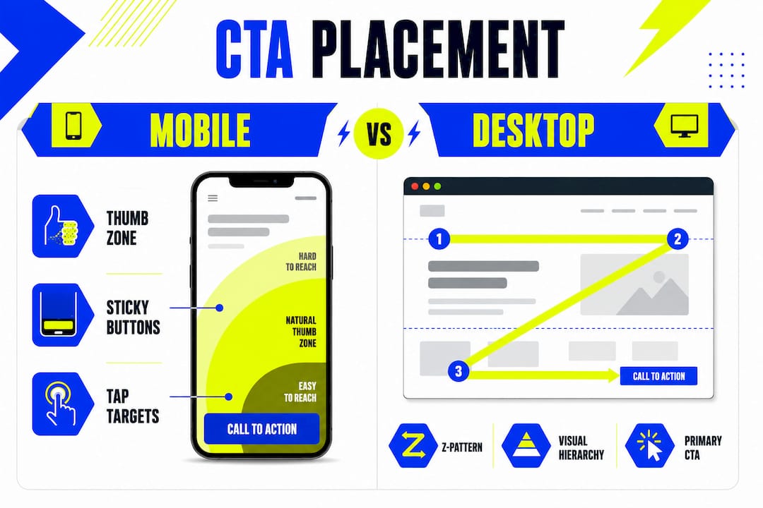
75% of users operate smartphones one-handed, making the bottom 25% of the viewport the most accessible area for interaction. This region is called the thumb zone. Placing your primary CTA here reduces the physical effort required to tap it, which directly reduces drop-off. A CTA positioned at the top centre of a mobile screen forces an awkward stretch. That small friction point, repeated across thousands of sessions, adds up to a meaningful loss in conversions.

Sticky CTAs solve the visibility problem on long-scrolling mobile pages. Sticky CTAs increase conversion rates by 27%, while floating CTAs on e-commerce platforms improve add-to-cart rates by 33%. The mechanism is simple: the CTA stays in view regardless of how far the visitor scrolls, so the opportunity to act is never lost. However, overly aggressive pop-ups reduce engagement and increase bounce rates. Sticky bars that sit quietly at the bottom of the screen outperform intrusive overlays every time.
Mobile CTA buttons also need adequate tap targets. A minimum of 44×44 pixels is the standard recommended by accessibility guidelines. Buttons smaller than this cause mis-taps, which frustrate visitors and signal poor design.
Desktop: follow the Z-pattern
Desktop users scan pages in a Z-pattern, moving from top-left to top-right, then diagonally to bottom-left, and finishing at bottom-right. Z-pattern design places CTAs at top-right and bottom positions, as these are natural cognitive pause points where users are most likely to make a decision. A navigation bar CTA at the top-right and a closing CTA at the bottom of the main content block align perfectly with this scan path.
The numbered steps below summarise effective CTA positioning by device:
- Mobile, primary CTA: position in the bottom 25% of the viewport, within natural thumb reach
- Mobile, long pages: use a sticky bottom bar that remains visible during scrolling
- Desktop, above fold: place the primary CTA top-right, aligned with the Z-pattern endpoint
- Desktop, mid-page: insert a secondary CTA after a strong testimonial or results section
- Desktop, page close: repeat the primary CTA at the bottom-right as the final decision prompt
For professional services businesses that rely on converting website visitors into enquiries, applying device-specific placement is one of the fastest ways to see measurable improvement without redesigning the entire page.
How to craft clear, outcome-led CTA copy that aligns with placement
CTA copy and placement are inseparable. A perfectly positioned button with weak copy still fails. High-performing UK service websites use benefit-led CTA copy of 5–7 words that clearly explain the outcome, consistently outperforming generic labels like “Submit” or “Click Here.” The reason is straightforward: visitors want to know what happens next, not just that something will happen.
Outcome-led copy answers the question “What do I get?” in the button itself. “Get my free brand audit” outperforms “Send” because it names the reward, sets an expectation, and feels low-risk. “Book your 30-minute call” outperforms “Contact us” because it specifies the commitment. These are not stylistic preferences. They are conversion decisions backed by consistent testing across UK markets.
The LIFT model identifies Anxiety as one of the six factors that determines whether a visitor acts. Microcopy placed directly beneath a CTA button addresses this. A line like “No credit card required” or “We reply within one business day” removes the hesitation that generic buttons leave unresolved. This supportive microcopy costs nothing to add and consistently lifts click rates.
Strong CTA copy principles for UK audiences:
- Keep it to 5–7 words and lead with a verb: “Get,” “Book,” “Download,” “Start”
- Name the outcome, not the action: “Get your free quote” beats “Submit your details”
- Match the copy to the page context: a pricing page CTA should reference cost or value; a case study page CTA should reference proof or results
- Use first-person phrasing where natural: “Show me how it works” consistently outperforms “Learn more”
- Add microcopy beneath the button to resolve the single biggest objection at that point in the page
Pro Tip: Read your CTA copy aloud as if you are the visitor. If it sounds like something a form would say rather than something a person would say, rewrite it. The best CTA copy sounds like a confident next step, not a data-capture prompt.
For deeper guidance on persuasive website copy that supports your CTA strategy, the principles of clarity and outcome-focus apply equally to every line on the page, not just the button.
Which tools and tests validate effective CTA placement?
Testing is the only way to confirm that your placement decisions are working. Assumptions about what visitors prefer are frequently wrong, and even experienced marketers are surprised by A/B test results.
The table below outlines the primary methods for validating CTA placement and copy:
| Method | What it measures | Best used for |
|---|---|---|
| A/B testing | Click-through rate, conversion rate | Comparing two CTA positions or copy variants |
| Heatmaps | Where visitors click and hover | Identifying ignored or over-clicked page areas |
| Scrollmaps | How far visitors scroll | Confirming whether below-fold CTAs are seen |
| Session recordings | Full visitor behaviour | Diagnosing drop-off points before and after CTAs |
| Conversion rate tracking | Goal completions | Measuring overall CTA effectiveness over time |
Heatmap tools reveal a pattern that surprises most business owners: visitors frequently click on non-linked images and headings near CTAs. This signals that the CTA itself is not visually prominent enough, or that the surrounding content is generating more interest than the button. Scrollmaps answer a different question: are visitors even reaching your below-fold CTA? If 60% of visitors leave before scrolling past the hero section, a below-fold placement is invisible to the majority of your audience.
The most common mistake in CTA placement is presenting multiple competing CTAs at the same point on the page. When a visitor sees “Book a call,” “Download the guide,” and “View our portfolio” in the same section, the result is decision paralysis. Conversion rates drop because no single action feels like the obvious next step. Each page section should have one primary CTA. Secondary options, if needed, should be visually subordinate.
Intent routing is a technique that sidesteps this problem for pages serving mixed audiences. Rather than one CTA, you offer two self-selection paths: “I have a question” versus “I am ready to book.” This approach, used by B2B professional services firms to align CTAs with different buyer stages, reduces friction by letting visitors choose their own readiness level. The result is higher engagement across both paths because neither feels premature.
For a structured approach to improving conversion rates across your full website, CTA placement testing sits within a broader optimisation process that includes page speed, visual hierarchy, and trust signals.
Key takeaways
Effective CTA placement matches the position of the prompt to the visitor’s readiness to act, shaped by content complexity, device type, and copy clarity.
| Point | Details |
|---|---|
| Match placement to content complexity | Use above-the-fold CTAs for simple offers; place CTAs below persuasive content for complex B2B services. |
| Prioritise the mobile thumb zone | Position mobile CTAs in the bottom 25% of the viewport where one-handed users can reach them easily. |
| Use sticky CTAs on long pages | Sticky bottom bars keep the CTA visible during scrolling and increase conversion rates by 27%. |
| Write outcome-led copy of 5–7 words | Name the reward in the button text and add microcopy beneath to resolve the visitor’s main concern. |
| Test with heatmaps and A/B splits | Use scrollmaps to confirm CTA visibility and A/B tests to validate copy and position decisions. |
What I have learned from watching CTAs succeed and fail
The most revealing thing about CTA placement is how often businesses treat it as a design decision rather than a persuasion decision. I have seen beautifully designed buttons in precisely the wrong position, and plain text links in exactly the right one, with the plain link winning every time. Position follows readiness. That is the principle that everything else in this article builds on.
The mobile thumb zone insight changed how I think about page layout entirely. Once you accept that 75% of visitors are holding their phone with one hand, you stop designing pages from the top down and start designing them from the thumb up. The CTA is not the last thing you place on the page. It is the anchor around which the rest of the content is arranged.
Intent routing is the technique I recommend most often to businesses with mixed audiences. Offering two paths, one for browsers and one for buyers, removes the awkward compromise of a single CTA that tries to speak to everyone and ends up resonating with no one. The self-selection moment also gives you data: if 80% of visitors choose “I have a question,” your page is attracting early-stage visitors and your content strategy needs to shift.
The uncomfortable truth about CTA optimisation is that most businesses test too rarely and change too much at once. Run one test, measure it properly, then move to the next. Iterative improvement over six months will outperform a complete page redesign every time.
— Kukoo
How Kukoocreative can strengthen your CTA strategy through design
Great CTA placement only works when the surrounding design supports it. If your page lacks visual hierarchy, brand credibility, or clear layout structure, even a perfectly positioned button will underperform. At Kukoocreative, we have spent over a decade helping business owners build websites and brand identities that make every element, including the CTA, work harder.
From logo design that builds instant trust to full web design projects built around conversion principles, Kukoocreative brings together design expertise and marketing understanding in one place. If you want a website where the layout, copy, and CTA placement all pull in the same direction, explore our web design process and see how we approach it for UK businesses.
FAQ
What is the best position for a CTA on a landing page?
Above the fold works best for simple offers with immediate appeal. For complex services, place the CTA after persuasive content that resolves visitor concerns, as this approach can increase conversions by 20–220%.
How does the thumb zone affect mobile CTA placement?
The thumb zone covers the bottom 25% of the mobile viewport. Because 75% of users hold phones one-handed, placing CTAs in this area reduces friction and improves tap rates significantly.
How many CTAs should a page have?
Each page section should have one primary CTA. Multiple competing CTAs at the same point create decision paralysis and reduce overall conversion rates.
What makes CTA copy effective for UK audiences?
Benefit-led copy of 5–7 words that names the outcome outperforms generic labels like “Submit.” Adding microcopy beneath the button to address the visitor’s main concern further improves click rates.
How do I test whether my CTA placement is working?
Use A/B testing to compare positions and copy variants, scrollmaps to confirm that below-fold CTAs are actually seen, and heatmaps to identify whether visitors are engaging with the button or ignoring it.