
Finding the right brand colours can feel like a puzzle when your Leeds creative business needs to stand out and connect with the right audience. The colours you choose do more than make things look appealing—they visually express your brand’s passion, values, and unique appeal. By learning how to define your brand’s core message, align with current trends, and test colour palettes for emotional impact, you can build a visual identity that resonates deeply and attracts your ideal client.
Table of Contents
- Step 1: Define Your Brand’s Core Values And Audience
- Step 2: Research Competitors And Creative Industry Trends
- Step 3: Select Colour Palettes That Reflect Your Message
- Step 4: Test Brand Colours Across Key Design Assets
- Step 5: Evaluate Colour Choices With Your Target Audience
Quick Overview
| Important Insight | Clarification |
|---|---|
| 1. Define your brand values | Establish your core values to guide colour choices that visually communicate your brand identity. |
| 2. Research competitors’ colours | Analyse competitors’ palettes to identify gaps and differentiate your brand’s visual presence. |
| 3. Choose an effective colour palette | Select colours that represent your brand’s message and evoke desired emotional responses from your audience. |
| 4. Test colours across platforms | Ensure your colours work consistently across digital and print formats to maintain brand identity. |
| 5. Gather audience feedback | Validate your colour strategy by collecting responses from your target audience to ensure emotional connection. |
Step 1: Define your brand’s core values and audience
Choosing the right brand colours is fundamentally about communicating your business’s essence visually. Before selecting any palette, you need to understand the foundational elements of your brand’s identity and target market.
Start by conducting a deep exploration of your brand’s core values. What principles define your business? Are you innovative and modern, or traditional and reliable? Your colour choices will act as a silent communicator of these fundamental characteristics. Effective audience segmentation helps ensure your colour strategy resonates precisely with your intended market.
Consider these key factors when defining your brand’s core values and audience:
- Identify your business’s primary mission and emotional tone
- Research your target demographic’s preferences and psychological responses to colour
- Analyse competitors’ colour strategies to differentiate your brand
- Map your brand personality traits (professional, playful, sophisticated, approachable)
Your colour palette should speak directly to your ideal customer’s subconscious expectations and emotional triggers.
Understanding your audience means going beyond basic demographics. Dive into their motivations, challenges, and aspirational desires. A healthcare startup targeting young professionals will require a dramatically different colour approach compared to a traditional family-run bakery in Leeds.
Here is a summary of how different types of businesses may approach colour selection:
| Business Type | Typical Colour Approach | Intended Emotional Impact |
|---|---|---|
| Technology Start-up | Cool blues, greys | Reliability, innovation |
| Creative Agency | Vibrant oranges, reds | Energy, enthusiasm |
| Family-run Bakery | Warm neutrals, pastels | Comfort, tradition |
| Healthcare Provider | Calm greens, blues | Trust, calmness |
Top tip: Conduct informal surveys or focus groups with potential customers to validate your colour strategy before finalising your brand palette.
Step 2: Research competitors and creative industry trends
Researching your competitors’ colour strategies is a critical step in developing a distinctive and impactful brand palette. Your goal is to understand the visual landscape while finding opportunities to stand out and communicate your unique brand personality.
Begin by conducting a comprehensive visual audit of your industry. Competitive brand comparisons require objective analysis of how other businesses use colour to position themselves in the market. Map out the predominant colour trends within your specific creative sector, paying close attention to:
- Colour palettes used by direct competitors
- Emerging colour trends in your industry
- Psychological implications of current colour choices
- Innovative colour applications that challenge traditional approaches
Understanding industry colour trends allows you to strategically differentiate while remaining recognisably professional.
Go beyond surface-level observations. Dive deep into the emotional resonance of colours used by successful brands in your sector. A technology startup might lean towards cool, sophisticated blues and greys, while a creative agency could embrace more vibrant, energetic tones. The key is finding a balance between industry expectations and your brand’s unique character.
Practical advice: Create a visual mood board capturing competitor colour schemes and emerging industry trends to inform your strategic colour selection process.
Step 3: Select colour palettes that reflect your message
Selecting the right colour palette is about creating a visual language that communicates your brand’s deepest essence. Your chosen colours will speak volumes before a single word is read, making this step crucial for effective brand communication.
Functional colour design principles demonstrate how carefully selected colours can convey specific purposes and emotional contexts. Consider developing a primary colour palette that includes:
- One dominant brand colour representing your core identity
- Two to three complementary secondary colours
- Neutral tones for balanced backgrounds and typography
- Accent colours for highlighting key elements
Colours are not just visual elements, but powerful communication tools that translate your brand’s personality into an immediate visual experience.
Understand the psychological impact of your chosen colours. A technology company might use cool blues to suggest reliability and innovation, while a creative agency could employ vibrant oranges to convey energy and enthusiasm. Each colour should intentionally support the narrative you want to tell about your brand.

Practical advice: Test your colour palette across multiple applications to ensure consistency and emotional resonance in different contexts and media.
Step 4: Test brand colours across key design assets
Testing your brand colours is a critical phase that ensures visual consistency and effectiveness across different platforms and materials. This step transforms your theoretical colour palette into a practical, robust brand identity.
Comprehensive colour testing involves examining your selected colours across multiple design contexts, ensuring they maintain their intended impact and accessibility. Develop a systematic approach to evaluating your colour palette by considering these key assessment areas:
- Digital platform compatibility (web, mobile, social media)
- Print materials (business cards, brochures, signage)
- Screen and print contrast ratios
- Legibility across different backgrounds
- Emotional resonance in various applications
Your brand colours must communicate consistently, whether viewed on a smartphone screen or printed marketing collateral.
Each colour should undergo rigorous testing to verify its performance. A deep blue that looks sophisticated on a website might appear muddy on a business card, or an accent colour might lose its vibrancy when reproduced in different printing processes. Detailed colour testing helps you catch and correct these potential discrepancies before finalising your brand palette.
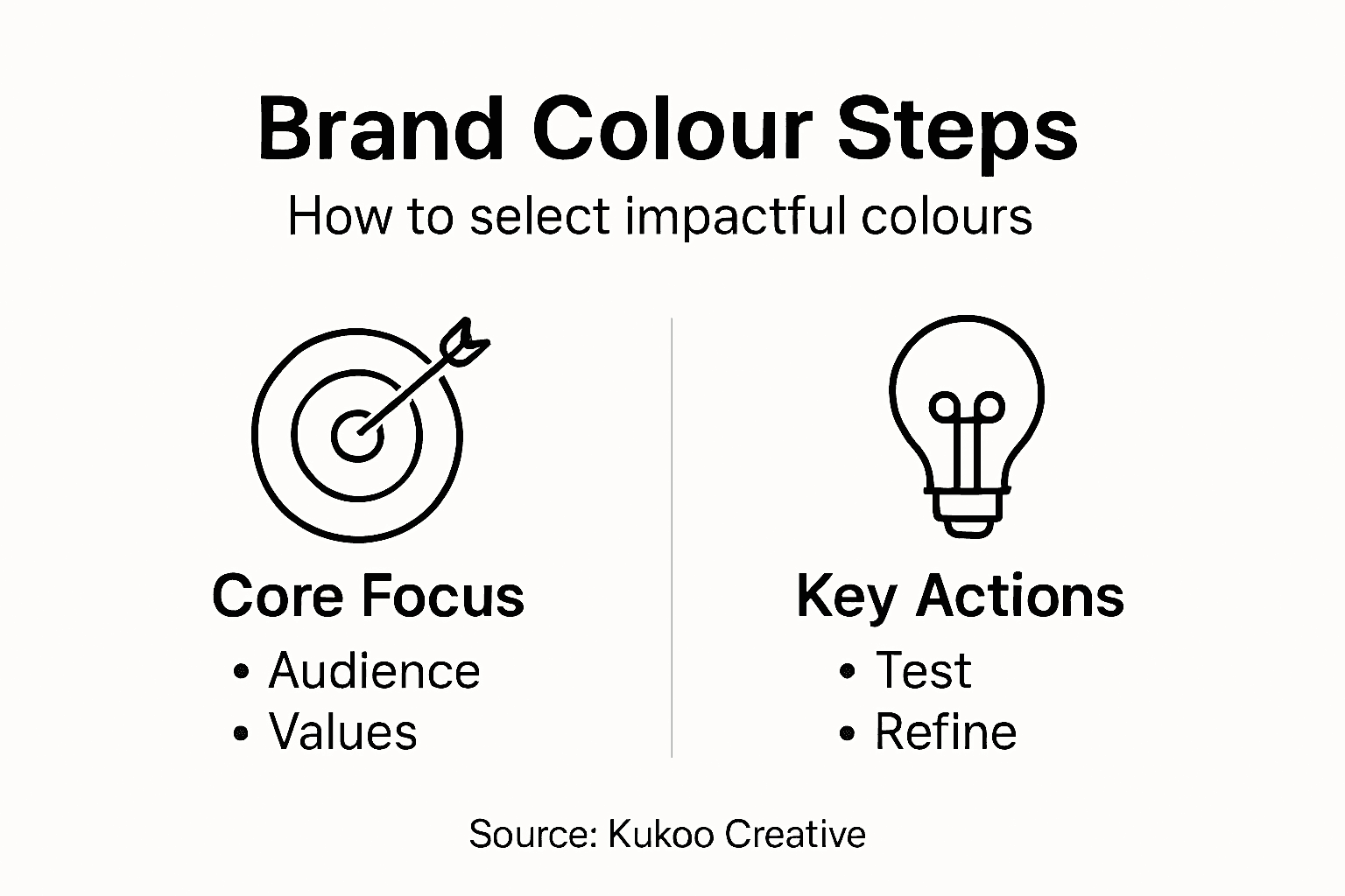
Practical advice: Create physical and digital mockups of your colour palette across different mediums to ensure true visual consistency and professional presentation.
Step 5: Evaluate colour choices with your target audience
Understanding how your target audience perceives and responds to your brand colours is the final, critical validation of your colour strategy. This step transforms theoretical colour selection into a data-driven, emotionally resonant visual identity.
Colour preference research provides crucial insights into how different demographic groups interpret and react to specific colour palettes. Develop a systematic approach to audience evaluation by:
- Conducting focused surveys with representative target groups
- Hosting small focus group discussions
- Using visual preference tests
- Tracking emotional and cognitive responses
- Gathering quantitative and qualitative feedback
Your colour choices must not just look good, but fundamentally connect with your audience’s subconscious perceptions.
Pay close attention to nuanced reactions. Psychological colour interpretation varies significantly across different age groups, cultural backgrounds, and professional contexts. A colour that energises a young creative audience might feel jarring to a more conservative professional demographic.
The following table compares methods for evaluating brand colour effectiveness:
| Evaluation Method | What it Measures | Ideal When Used |
|---|---|---|
| Surveys | Audience preference and appeal | Large, diverse groups |
| Focus Groups | Emotional and verbal reactions | In-depth feedback needed |
| Mockups | Visual consistency in context | Testing real-life usage |
| Visual Preference Tests | Instinctive colour responses | Early-stage validation |
Practical advice: Create visual presentations with multiple colour variations and gather structured feedback to identify the most compelling and authentic palette for your brand.
Elevate Your Brand with Expert Colour Strategy Support
Choosing the perfect brand colours that truly connect with your audience can feel overwhelming. The challenge lies in defining your core values clearly while ensuring your palette stands out in a competitive landscape. From researching competitor palettes to testing emotional resonance, the process demands precision and insight to avoid costly mistakes.
At Kukoo Creative, we understand how crucial each colour choice is in building brand recognition and sparking emotional connections. With over a decade of experience partnering with business owners, we help you translate your unique brand personality into compelling visual identities including logos and websites that resonate deeply with your target market.
Ready to transform your colour strategy into a powerful visual story that captures your audience instantly?
Discover how our expert design solutions can bring your brand colours to life and create maximum impact today. Visit Kukoo Creative to start your journey. Explore how we combine strategic insights with creative excellence at our landing page and learn more about our passion for building brands that connect on a profound level.
Frequently Asked Questions
How do I define my brand’s core values for colour selection?
To define your brand’s core values, identify your primary mission and emotional tone. Conduct a survey or focus group with your target audience to gain insights into their preferences and desires, aiming to complete this within 30 days.
What colour approaches work best for different types of businesses?
Different types of businesses utilise specific colour strategies; for instance, technology startups often use cool blues, while creative agencies might favour vibrant colours. Review your competitors’ colour choices and create a mood board to visualise potential palettes that align with your brand personality.
How can I research competitors’ colour strategies effectively?
Begin by conducting a visual audit of your industry, mapping out competitors’ colour palettes and trends. Aim to create a comparative analysis within two weeks to identify gaps and opportunities for differentiation.
What steps should I take to select my brand’s colour palette?
Selecting a colour palette involves creating a primary palette with a dominant colour, several complementary hues, and neutral tones. Draft this palette during a one-week workshop with your team to ensure it aligns with your brand identity and emotional messaging.
How can I test brand colours across different design assets?
Test your colours across digital and print materials to ensure consistency and effectiveness. Set up mockups for at least three different platforms, and evaluate their performance within the next month to make any necessary adjustments.
How do I evaluate colour choices with my target audience?
To evaluate your colour choices, conduct surveys or focus groups to gather feedback on audience reactions. Collect diverse responses within a 30-day window, using the feedback to refine your colour palette before finalising it.