Building a truly memorable brand identity is tough when every detail matters. Your clients expect their logo, colours, imagery, and website to speak with one voice, yet consistency can easily slip away across different touchpoints. Without clear visual strategy, brands risk becoming forgettable or confused in the eyes of their audience.
What if you could guide your clients towards a cohesive identity that stands out instantly? This list reveals proven tactics used by renowned institutions—like HARVARD and OXFORD—to create iconic branding. You’ll get practical examples and actionable advice on colour palettes, typography choices, photography styles, and more.
Get ready to discover professional techniques that turn scattered visuals into a unified brand presence. Each insight is designed to help you deliver identity strategies your clients will recognise and trust every time.
Table of Contents
- Iconic Logo Design for Instant Recognition
- Consistent Use of Colour Palettes for Cohesion
- Memorable Typography Choices to Define Tone
- Unique Brand Imagery and Photography Styles
- Cohesive Website Layouts for Strong Identity
- Branded Social Media Templates for Engagement
- Creative Packaging and Print Materials Examples
Quick Summary
| Key Insight | Explanation |
|---|---|
| 1. Create Iconic Logos | Develop logos that are simple yet memorable to enhance brand recognition across various platforms. |
| 2. Use Consistent Colour Palettes | Establish a unified colour strategy that reflects brand values and triggers instant recognition among audiences. |
| 3. Prioritise Typography Choices | Select typefaces that convey personality and remain legible across different sizes and contexts for effective communication. |
| 4. Maintain Cohesive Website Designs | Ensure website layouts are consistent to enhance user experience and reinforce brand identity throughout all pages. |
| 5. Implement Branded Social Media Templates | Create flexible templates aligned with brand guidelines to enhance visual identity and streamline content creation on social platforms. |
1. Iconic Logo Design for Instant Recognition
A logo that people instantly recognise is worth more than years of advertising spend. When someone sees your logo, they should immediately know who you are and what you stand for. This is where iconic logo design separates the businesses that fade into the background from those that become household names. An iconic logo doesn’t shout or demand attention. Instead, it whispers with such clarity and confidence that people naturally remember it. For creative agencies, understanding how iconic logos achieve instant recognition across different sectors gives you the tools to build something equally powerful for your clients.
Look at the world’s most recognisable logos. Harvard’s shield remains virtually unchanged from its original design. Oxford’s distinctive crest has stood the test of time. What these institutions understood centuries ago is something your agency clients need to grasp now: simplicity combined with intentionality creates permanence. These logos work because they use straightforward typography, meaningful symbols, and consistent colour palettes that reflect the organisation’s core values. They aren’t trendy. They’re timeless. The design choices made for these logos consider how they’ll appear on a business card, a website header, a building facade, and in a tiny favicon. Every detail serves a purpose. When you’re developing a logo for your clients, you’re not creating something decorative. You’re creating a visual anchor that will appear thousands of times across different contexts and scales.
The magic happens when simplicity meets strategy. Your clients might be tempted to overload their logo with design elements, thinking more detail equals more impact. The opposite is true. Iconic logos strip away everything unnecessary and keep only what matters. A good exercise for your client meetings is to sketch their logo at thumbnail size. If people still recognise it and understand what it represents, you’ve hit the mark. This approach also means their logo will work brilliantly whether it’s printed on a billboard or displayed as a 16-pixel app icon. Colours matter tremendously too. Iconic logos often rely on distinctive colour combinations that become inseparable from the brand itself. Think of how quickly people associate specific colours with certain organisations. When you develop a cohesive colour strategy that reflects your client’s personality and values, you’re creating visual shortcuts in people’s minds that trigger instant recognition.
Professional tip: Create a detailed brand style guide for each client that specifies minimum logo sizes, clear space requirements, and restricted zones where other design elements cannot appear. This protects the logo’s integrity across all touchpoints and prevents it from becoming diluted or unrecognisable in various applications.
2. Consistent Use of Colour Palettes for Cohesion
Colour is the fastest way your clients’ brands get recognised. Before someone reads a single word or processes a logo, they see colour first. A consistent colour palette across all touchpoints transforms scattered marketing materials into a unified visual identity that people instinctively trust. When your clients use the same colours on their website, business cards, packaging, social media, and print materials, they’re not being repetitive. They’re building brand muscle memory. This consistency tells customers that they’re looking at materials from the same organisation, which strengthens recognition and confidence.
Think of colour as emotional shorthand. Different colours trigger different feelings and associations. Blue conveys trust and professionalism. Green suggests growth and sustainability. Red demands attention and energy. When you establish a strategic colour palette aligned with your client’s brand values and their audience’s expectations, you’re doing more than picking pretty shades. You’re creating a psychological connection that works constantly, even subconsciously. Many leading organisations use strictly defined colour proportions and usage guidelines to maintain cohesion across every application. This means specifying which colour appears where, how much space it occupies, and when accent colours come into play. This level of detail ensures the brand remains visually consistent whether it appears on a huge billboard or a tiny social media thumbnail.
Practically speaking, your clients need a colour palette strategy that addresses multiple contexts. Digital screens display colours differently than printed materials. A colour that looks perfect on a website might shift slightly when printed on cardboard or textiles. Your brand guidelines should specify exact colour codes for web (RGB and hexadecimal values), print (CMYK values), and possibly Pantone specifications for precision. Accessibility matters too. Colour combinations must maintain sufficient contrast for people with colour blindness or visual impairments. Beyond technical specifications, strategic colour selection aligned with brand values strengthens recognition and audience connection across all media. When your clients’ competitors use five colours and your clients use three, guess whose brand people remember? Simplicity and consistency win every time. Encourage your clients to resist the urge to add new colours whenever a new campaign launches. The longer they stick with their core palette, the stronger the association becomes.
Professional tip: Create a comprehensive colour specification document for every client that includes RGB, CMYK, Pantone, and hex codes for each colour, plus clear guidelines showing acceptable colour combinations, minimum contrast ratios for accessibility, and real world examples of how colours appear in both digital and print applications.
3. 3. Memorable Typography Choices to Define Tone
Typography is your client’s voice made visible. Before anyone reads their words, they experience the typeface itself. A bold, geometric sans serif says something entirely different from a delicate, flowing serif font. The fonts your clients choose communicate tone, personality, and professionalism faster than any headline ever could. When you select typography carefully, you’re not just picking fonts that look nice together. You’re orchestrating how people feel about your client’s brand from the moment they lay eyes on it. This is why typography choices deserve the same strategic attention as logo design and colour palettes.
Different typefaces trigger different emotional responses. A modern, minimalist sans serif conveys innovation and forward thinking. A traditional serif typeface suggests heritage, stability, and trustworthiness. Rounded fonts feel approachable and friendly. Geometric fonts communicate precision and professionalism. When your clients operate in finance or law, they need typography that builds credibility and confidence. When they operate in creative industries or lifestyle sectors, they might choose something bolder and more distinctive. Understanding how fonts shape business identity and recognition helps you make choices that align with both their industry expectations and their unique positioning. The key is selecting typefaces that remain legible across all sizes and contexts whilst still expressing personality. A font that looks stunning on a poster might become unreadable at tiny sizes on a website. Your clients need typefaces that work beautifully from a billboard down to a favicon.
Practically speaking, most successful brands use two or three typefaces maximum. One primary typeface carries the brand’s personality in headlines and key messaging. A secondary typeface, usually more neutral and highly legible, handles body copy and smaller text. Some brands introduce a third accent typeface for special applications. This constraint forces clarity. When your clients have too many fonts bouncing around their materials, they look disorganised and unfocused. Consistency with typography works the same way as consistency with colour. Every time someone sees your client’s typeface, it triggers brand recognition. They start to associate that specific font with that specific business. Over months and years, this association strengthens until the typeface itself becomes inseparable from the brand identity. When your clients spend money on design work, typography is where they can show personality without breaking the budget.
Professional tip: Test every typeface choice at multiple sizes and across different media before finalising your recommendation. Create sample mockups showing headlines at 72pt on a poster, body text at 12pt on a website, and small text at 10pt on business card. This reveals whether the typeface maintains its character and legibility across all real world applications your client will encounter.
4. 4. Unique Brand Imagery and Photography Styles
Photography is storytelling without words. The images your clients use across their website, social media, and marketing materials communicate more powerfully than any carefully crafted copy. A consistent photographic style becomes instantly recognisable and creates an emotional connection with your audience. When people scroll through a brand’s social feed and recognise the photography before reading the caption, that’s when visual branding has truly succeeded. Your clients need a distinctive photographic approach that reflects their brand personality and values whilst remaining consistent enough that people instinctively know it’s them.
The most powerful brand photography captures authenticity rather than perfection. Leading organisations understand that candid, genuine moments with natural lighting resonate far more deeply than heavily staged shots. People can sense when photography feels real versus manufactured. Authentic imagery showing actual interactions, genuine expressions, and diverse representation builds trust and relatability. This doesn’t mean amateur quality. It means intentional, thoughtful photography that prioritises truth over polish. Some of the strongest brands use dynamic, energetic photography that avoids staged or posed approaches and instead focuses on capturing the vibrancy and diversity of their community. When your clients choose their photography style, they’re essentially choosing a visual voice that either whispers subtly or speaks boldly. High contrast colour photography feels energetic and modern. Softer, more muted palettes feel calm and refined. Black and white photography conveys sophistication and timelessness.
Getting this right for your clients requires intentional decision making. Start by identifying the emotional response you want their photography to trigger. Do they want to feel approachable and friendly? Then warm lighting, genuine smiles, and natural settings work better than sterile studio environments. Do they want to convey professionalism and expertise? Then clean compositions, consistent framing, and deliberate subject matter matter more. Once you’ve established the photographic direction, document it thoroughly in brand guidelines so anyone taking photos for your clients follows the same approach. This might mean specifying preferred lighting conditions, composition styles, colour treatment, and the types of moments worth capturing. When your clients invest in custom photography rather than relying on generic stock images, they’re investing in differentiation. Generic stock photography makes brands look interchangeable. Custom photography tied to your clients’ specific story, team, and values makes them unforgettable.
Professional tip: Create a detailed photography mood board for each client showing 8 to 12 reference images that demonstrate the exact style, lighting, colour treatment, and emotional tone you want to achieve. Include images both from your industry and outside it to inspire fresh thinking, then brief any photographers or videographers with this mood board as your north star.
5. 5. Cohesive Website Layouts for Strong Identity
Your client’s website is often the first impression potential customers get. It’s where brand identity either comes together beautifully or falls apart in fragments. A cohesive website layout ensures that every page, every button, and every image reinforces the same brand story. When visitors move from the homepage to a service page to a case study, they should feel like they’re moving through one unified experience, not jumping between different websites. This consistency builds trust, improves navigation, and most importantly, strengthens brand identity by making the visual experience predictable and memorable.
Cohesion on a website works through repetition and logic. The same header navigation appears on every page in the same location. The colour palette mirrors the brand guidelines you’ve already established. Typography remains consistent throughout. Spacing and alignment follow a clear grid system so nothing feels randomly placed. When you design a cohesive layout, you’re creating an invisible structure that guides the user’s eye and creates visual harmony. Think of it like arranging a room. If furniture is scattered haphazardly, the room feels chaotic. But when pieces are thoughtfully arranged with clear purpose, the space becomes inviting and functional. Website layouts work the same way. Enhancing user experience through cohesive visual design means every element serves a purpose and contributes to the overall identity. Your clients should recognise themselves instantly when they see their website because it looks exactly like their brand.
Practically, this means creating a design system before building individual pages. Define how headings should appear, how buttons should look, what spacing surrounds images, and how different content sections are visually separated. Create a page template library that designers can work from consistently. Document these decisions clearly so when new pages are added later, they automatically follow the established pattern. Many agencies skip this step and create each page independently, resulting in layouts that feel disjointed. Your clients deserve better. A cohesive website layout isn’t just about aesthetics. It’s a strategic tool that reinforces brand identity, reduces cognitive load for visitors, and makes their website feel professional and intentional. When users can navigate intuitively because the layout makes sense, they’re more likely to stay longer and convert.
Professional tip: Create a comprehensive website component library documenting every repeatable element, from button styles to card layouts to form fields, with exact specifications for spacing, sizing, and colour. Share this document with your clients so they understand how their brand consistency translates into a superior user experience across all pages.
6. 6. Branded Social Media Templates for Engagement
Social media moves fast. Your clients need to post consistently, but creating each piece of content from scratch drains time and resources. Branded social media templates solve this problem whilst strengthening visual identity. When your clients use consistent templates across Facebook, Instagram, LinkedIn, and other platforms, their content becomes instantly recognisable in crowded feeds. People start scrolling and immediately think “that’s them” before reading a single word. Templates aren’t about being formulaic or boring. They’re about creating a visual framework that allows your clients to post frequently whilst maintaining professional consistency.
The best branded templates follow the core brand guidelines but remain flexible enough for different types of content. A template might feature the brand’s colour palette on the borders, use the established typography for headlines, and include space for the client’s unique photography or messaging. Institutional templates ensure consistent visual identity and unified messaging across social platforms whilst supporting efficient content creation. When templates incorporate official logos, colour schemes, and photographic style consistently, they transform scattered social posts into a cohesive brand narrative. Your clients benefit in multiple ways. First, content creation becomes faster. A designer or social media manager can grab a template and focus on the message rather than starting design from zero. Second, consistency improves brand recognition. When followers see the same visual framework repeatedly, they build familiarity and trust. Third, templates prevent brand dilution. Without them, different team members might use different colours, fonts, or layouts, creating a chaotic visual impression.
Implement this by creating 5 to 8 core template designs that cover the most common content types your clients post. A template for quote posts. Another for behind the scenes content. One for customer testimonials. Another for product or service announcements. One for educational content or tips. Social media templates aligned with official branding standards facilitate efficient audience connection and consistent messaging across networks. Make these templates available in Canva, Adobe Express, or similar tools so your clients can actually use them without needing design expertise. Include placeholder text showing where headlines go, which imagery works best, and how to maintain whitespace. When your clients post from these templates regularly, their social presence becomes unmistakably theirs. Over weeks and months, this consistency builds brand equity that generic, template-less posts never achieve.
Professional tip: Design templates that work at multiple sizes and aspect ratios since different social platforms have different requirements. Create versions for Instagram Stories (1080×1920), Instagram Feed (1080×1080), LinkedIn posts (1200×627), and Facebook (1200×628) so your clients have consistency across all channels without struggling with resizing.
7. 7. Creative Packaging and Print Materials Examples
Print materials and packaging are the tangible touchpoints where your clients’ brands come to life in people’s hands. A beautifully designed business card, an envelope, a product box, or a brochure creates a physical experience that digital alone cannot replicate. These materials represent your clients’ investment in quality and attention to detail. When someone opens a package or receives a business card that feels substantial, looks professional, and reinforces the brand identity established elsewhere, it creates a lasting impression. Creative packaging and print materials transform everyday interactions into brand moments that people remember.
The most effective packaging and print materials extend the visual identity established in logos, colours, and typography into the physical world. This means your clients’ branded materials should feel like an extension of their online presence rather than something disconnected. A well designed business card carries the same colour palette, typography, and visual style as their website. Packaging maintains brand consistency whilst considering how the product will actually be held, opened, and used. Print materials like brochures, flyers, and letterheads create cohesion across all client touchpoints. When customers receive an effective business card design that reflects the brand’s personality, it signals professionalism and care. Creative packaging goes beyond aesthetics. It considers the unboxing experience. What will customers feel when they open the box? What textures, materials, and visual surprises can create delight? Premium finishes like foil stamping, embossing, or specialty paper stocks elevate perception and justify premium pricing.
Implement this by auditing all physical materials your clients currently use. Business cards, letterheads, envelopes, packaging, labels, hang tags, stickers, folders, and any other printed collateral should follow the same visual system. Create specifications for each material type that detail acceptable logo usage, colour applications, typography hierarchy, and spacing requirements. Consider material choices strategically. A luxury brand might choose thick cardstock or matte finishes. A tech startup might prefer minimalist design on bright white stock. Eco conscious brands might prioritise sustainable materials. The choices you make communicate value and values. When your clients’ print materials and packaging genuinely reflect their brand identity, they become powerful marketing tools. Someone receives a business card and keeps it because it looks and feels exceptional. Someone unboxes a product and shares it on social media because the packaging is Instagram worthy. These moments create word of mouth marketing that paid advertising struggles to achieve.
Professional tip: Always request physical samples from your printer before approving final production. Colours on screen look different from colours on paper, and premium finishes like foil or embossing reveal details that digital mockups cannot show. Investing time in approving physical samples prevents costly reprints and ensures your clients receive materials that match their expectations.
Below is a comprehensive table summarising the key principles and recommendations for developing and maintaining a strong brand identity as discussed throughout the article.
| Concept | Details | Significance |
|---|---|---|
| Iconic Logo Design | Logos combine simplicity, intentional design, and consistency across applications. | Achieving instant brand recognition and establishing trust. |
| Effective Colour Palettes | Colours are chosen for their emotional impact and aligned with brand values. | Strengthen brand identity through consistent application across media. |
| Typography Choices | Fonts are selected based on readability and alignment with brand tone. | Enhance brand messaging visually and improve user experience. |
| Photography and Imagery | Authentic and consistent photographic styles create emotional connections. | Builds relatability and distinguishes the brand’s personality. |
| Website Cohesion | Unified layout and design maintain visual harmony across pages. | Enhances user navigation experience and consolidates brand perception. |
| Social Media Templates | Pre-designed templates enforce brand consistency in fast-paced content environments. | Promotes efficiency while strengthening brand recognition. |
| Physical Branding Materials | Business cards, packaging, and other print assets extend digital branding. | Provide tangible evidence of quality and reinforce the brand identity. |
This table encapsulates strategies to ensure a cohesive and recognisable brand image, beneficial for leveraging competitive advantage.
Elevate Your Brand with Cohesive Visual Identity Solutions
Struggling to create a visual brand that stands out yet remains consistent across all platforms is a common challenge for many agencies. This article highlights key concepts such as iconic logo design, strategic colour palettes, and cohesive website layouts which are essential to building strong brand recognition and emotional connections with audiences. If your goal is to eliminate fragmentation and project professionalism through every touchpoint, you need design solutions that prioritise simplicity, consistency and authenticity.
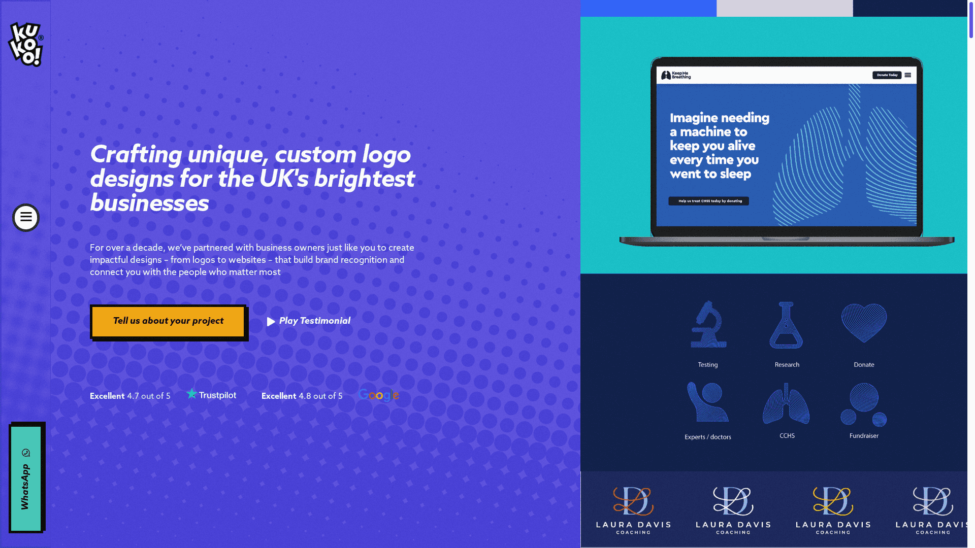
At Kukoo Creative, we have partnered with businesses for over a decade to craft impactful designs—from logos to complete websites—that connect you with the people who matter most. Our expertise covers everything from creating memorable typography choices to developing branded social media templates and packaging that reinforce your brand identity effectively. Explore how our tailored services align with the strategies discussed in this article by visiting Kukoo Creative and discover how we bring cohesive visual branding to life for your business.
Ready to transform your visual branding challenges into your greatest asset?
Start building a unified, recognisable brand with our expert design team today. Visit Kukoo Creative to learn more about our comprehensive branding and website solutions that ensure every detail reflects your brand values with clarity and impact.
Frequently Asked Questions
What are the key elements of visual branding for agencies?
Visual branding for agencies comprises logos, colour palettes, typography, photography styles, and cohesive website layouts. Focus on creating a unified visual identity that resonates with your audience and reflects your brand’s values. Conduct a brand audit to identify areas needing improvement.
How can an agency establish a consistent colour palette?
An agency can establish a consistent colour palette by aligning it with its brand values and ensuring it is applied across all touchpoints. Use specific colour codes for web and print to maintain consistency. Create a colour specification document to guide future design decisions and ensure visual unity.
Why is typography important in visual branding for agencies?
Typography is crucial because it communicates the brand’s personality and tone without using words. Select typefaces that reinforce your brand identity and remain legible across various sizes and platforms. Test typography choices at different sizes to ensure clarity and consistency across all materials.
How can agencies create memorable imagery for their branding?
Agencies can create memorable imagery by using authentic and genuine photography that reflects their brand values. Identify the emotions you want to evoke and select a photographic style that aligns with those goals. Document your photographic style in brand guidelines to ensure consistency across all platforms.
What steps should an agency take for cohesive website layouts?
To ensure cohesive website layouts, define a consistent design system including navigation, colour scheme, typography, and spacing. Create a template library that serves as a framework for new pages to follow. Regularly review and update your layout guidelines to maintain a harmonious user experience throughout the site.
How can branded social media templates enhance visual identity?
Branded social media templates enhance visual identity by providing a consistent look across various platforms, making content instantly recognisable to followers. Design templates that follow your brand guidelines, while allowing flexibility for different content types. Create 5 to 8 core templates to streamline content creation and maintain brand consistency.