
TL;DR:
- Mobile optimisation ensures websites load quickly and function well on smartphones, which is crucial for rankings and conversions. Google’s mobile-first indexing emphasizes the importance of maintaining core Web Vitals thresholds, responsive design, and user-friendly features like thumb-optimized navigation. Regular testing with tools like Google PageSpeed Insights and practical device trials helps maintain optimal mobile performance and SEO advantage.
Mobile optimisation is the practice of designing and developing websites to deliver fast, accessible, and user-friendly experiences on smartphones and tablets. Google’s mobile-first indexing, universal since july 2024, means your mobile site quality now determines your rankings across every device. UK adults spend 75–79% of their online time on smartphones, and mobile traffic accounts for approximately 54% of all UK web traffic. If your site performs poorly on mobile, you are not just losing visitors. You are losing rankings, revenue, and credibility.
What is mobile optimisation and which benchmarks define it?
Mobile optimisation, formally known as mobile site optimisation, is the process of meeting specific performance and usability standards that make a website work well on small screens with touch interfaces. Google sets these standards through its Core Web Vitals framework, which measures three critical signals.
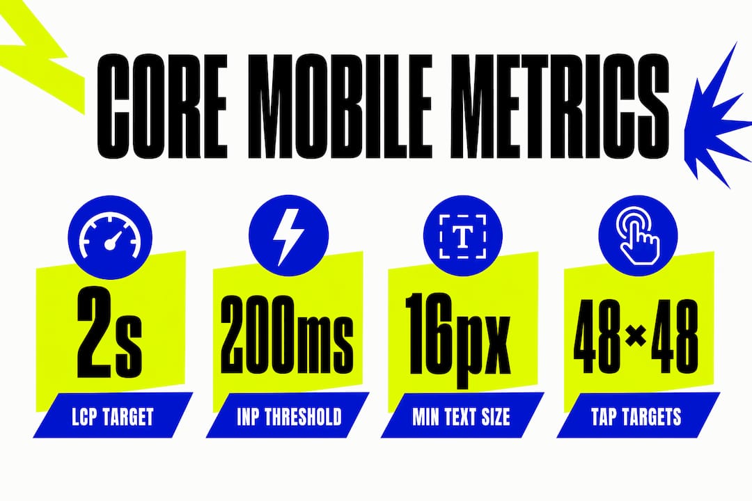
Largest Contentful Paint (LCP) measures how quickly the main content loads. The official threshold is 2.5 seconds, but ranking penalties begin as early as 2.3 seconds. Targeting sub-2-second LCP gives you a genuine competitive advantage in UK search results.
Interaction to Next Paint (INP) measures how fast your site responds to a tap or click. The threshold is under 200 milliseconds. Cumulative Layout Shift (CLS) measures visual stability, meaning how much your page jumps around as it loads. The threshold is 0.1 or below.
Beyond speed, mobile usability criteria include a minimum body text size of 16px and tap targets of at least 48×48 pixels. These usability standards prevent users from accidentally tapping the wrong button or squinting at text too small to read comfortably.
| Metric | Good threshold | Poor threshold |
|---|---|---|
| LCP (load speed) | Under 2.5s (aim for under 2s) | Over 4s |
| INP (interactivity) | Under 200ms | Over 500ms |
| CLS (visual stability) | Under 0.1 | Over 0.25 |
| Minimum font size | 16px body text | Under 12px |
| Tap target size | 48×48px | Under 44×44px |
Google’s december 2025 core update made these thresholds more consequential than ever. Sites with LCP over 3 seconds saw 23% more traffic loss, and INP over 300ms correlated with 31% more traffic loss. These are not minor penalties. They represent real business damage.
Pro Tip: Aim for LCP under 2 seconds rather than the official 2.5-second threshold. Google’s ranking algorithms apply pressure before the official limit, so the extra margin protects your rankings during algorithm updates.
Which strategies and techniques deliver effective mobile site optimisation?
Responsive web design is the foundation of any mobile site optimisation effort. Google describes it as ‘the easiest design pattern to implement and maintain’ and explicitly recommends it over dynamic serving or separate mobile URLs. A single responsive codebase adapts fluidly to any screen size, which means one set of content, one set of links, and one set of signals for Google to evaluate.

The benefits of responsive design go beyond technical simplicity. You avoid the risk of content mismatches between desktop and mobile versions, which can confuse both users and search engines.
Here are the core techniques that make mobile optimisation work in practice:
- Image optimisation: Use modern formats such as WebP or AVIF. Serve images at the correct display size rather than scaling them down in the browser. Lazy-load images below the fold so they do not delay the initial page load. A detailed guide on image optimisation for speed covers the specifics of format choices and compression settings.
- Thumb-friendly navigation: Place primary navigation and calls to action within the lower two-thirds of the screen, where thumbs naturally reach. Avoid dropdown menus that require precise tapping. Use a hamburger menu or bottom navigation bar for complex sites.
- Simplified forms: Reduce form fields to 3–5 inputs. Simplified mobile forms can boost conversions by approximately 50%. Use autofill attributes and large input fields to reduce friction for B2B users completing enquiry forms on the go.
- Scannable content: Mobile users scan rather than read, expect fast load times, and want key information upfront. Use short paragraphs, clear subheadings, and bullet points to make content easy to consume in 30-second bursts.
- Font and spacing: Stick to 16px or larger for body text. Increase line spacing to at least 1.5 to prevent lines from feeling cramped on a small screen.
Pro Tip: Test your site on a real device, not just a browser emulator. Emulators miss real-world issues like slow network conditions, font rendering differences, and touch event timing that only appear on physical hardware.
How does mobile optimisation influence SEO rankings and conversions?
Mobile-first indexing means Google evaluates your mobile version first when deciding where to rank your site. Mobile and desktop SEO are now intertwined. Neglecting your mobile experience directly harms your overall rankings, even for users searching on desktop computers.
The conversion impact is equally significant. Pages that load in 1 second convert at three times the rate of pages loading in 5 seconds. A 100ms improvement in load time can increase retail conversions by 8%. These numbers translate directly to revenue for any business running an e-commerce store or lead generation site.
The desktop-to-mobile conversion gap remains a real challenge. Mobile users convert at lower rates than desktop users, partly because of poor form design, slow load times, and navigation that was built for a mouse rather than a thumb. Closing this gap is one of the highest-return activities available to any website owner. Practical website optimisation steps address this gap systematically.
AI is reshaping mobile search in ways that demand attention. AI overviews appear in 42% of UK searches, and the zero-click rate on mobile sits at 77%. That means most mobile searchers never visit a website at all. To capture visibility in this environment, you need structured data markup and direct answer placement at the top of your pages. This approach, called Generative Engine Optimisation (GEO), ensures your content appears in AI-generated summaries rather than being bypassed entirely.
Key outcomes from strong mobile optimisation:
- Higher organic rankings through Core Web Vitals compliance
- Reduced bounce rates from faster load times and clearer navigation
- Increased form completions through simplified, thumb-friendly inputs
- Greater AI search visibility through schema markup and direct answers
- Improved brand credibility from a polished, professional mobile experience
What tools can you use to measure and improve mobile performance?
Measuring mobile performance requires a combination of automated tools and real-world testing. The right tools reveal exactly where your site falls short and what to fix first.
- Google PageSpeed Insights: Paste your URL and receive a score from 0–100 for both mobile and desktop. The tool flags specific Core Web Vitals failures and suggests fixes ranked by impact. Run it on your most important pages, not just your homepage.
- Google Lighthouse: Built into Chrome DevTools, Lighthouse runs a full audit covering performance, accessibility, and SEO. It is particularly useful for diagnosing INP issues and identifying render-blocking resources that delay LCP.
- Google Search Console (Mobile Usability report): This report shows pages Google has flagged for mobile usability failures, such as text too small to read or clickable elements too close together. Fix these issues first, as they directly affect your search appearance.
- Real User Monitoring (RUM): Tools that collect data from actual visitors reveal how your site performs across different devices, network speeds, and locations. This data often differs significantly from lab-based scores.
- Manual device testing: Test on a range of physical devices, including older Android handsets with slower processors. Many UK users access websites on mid-range devices, not the latest flagship smartphones.
For a broader view of mobile-friendly SEO performance, combining automated audits with real user data gives the most complete picture of where your site stands.
Pro Tip: Schedule a full mobile audit every quarter. Google updates its Core Web Vitals thresholds and ranking signals regularly. A site that passed in january may fail by april if Google tightens its criteria.
Common pitfalls these tools detect include uncompressed images inflating LCP, third-party scripts delaying INP, and font files loading before content. Each of these has a clear fix. Prioritise issues by their impact on Core Web Vitals scores rather than tackling them in the order they appear in a report.
| Tool | Best for | Cost |
|---|---|---|
| Google PageSpeed Insights | Quick Core Web Vitals check | Free |
| Google Lighthouse | Deep performance and accessibility audit | Free |
| Search Console Mobile Usability | Identifying Google-flagged usability failures | Free |
| Real User Monitoring | Actual visitor performance data | Varies |
Key takeaways
Mobile optimisation is the single most consequential factor in UK website performance in 2026, directly determining search rankings, conversion rates, and AI search visibility.
| Point | Details |
|---|---|
| Core Web Vitals are non-negotiable | Target LCP under 2s, INP under 200ms, and CLS under 0.1 to avoid ranking penalties. |
| Responsive design is the standard | Google recommends responsive design over all alternatives for mobile site optimisation. |
| Speed drives conversions | Pages loading in 1 second convert at three times the rate of pages loading in 5 seconds. |
| AI search changes the rules | With 77% zero-click mobile searches, schema markup and direct answers are now critical. |
| Regular audits protect rankings | Quarterly mobile audits catch issues before Google’s algorithm updates penalise your site. |
Why mobile optimisation is the one thing I would not cut corners on
Working on mobile projects across the UK market, the pattern I see most often is businesses that built a website three or four years ago and assumed it was “done.” They ticked the responsive design box and moved on. The problem is that Google’s standards have moved significantly since then, and a site that passed in 2022 may be actively losing rankings today.
The conversion gap between desktop and mobile is the issue that surprises clients most. They see mobile traffic growing, but revenue from mobile stays flat. The culprit is almost always a combination of slow load times and forms that were designed for a mouse. Fixing those two things alone can produce a meaningful lift in enquiries within weeks.
The shift toward AI-driven search results is the trend I watch most closely right now. A 77% zero-click rate on mobile is a number that should change how every website owner thinks about content. If your page does not answer the question directly in the first paragraph, an AI overview will answer it instead, and your site will not get the visit. Writing for mobile-first design and mobile-first content strategy is no longer optional. It is the baseline.
My honest recommendation: treat mobile optimisation as a quarterly discipline, not a one-off project. The businesses that do this consistently are the ones that hold their rankings through algorithm updates and close the conversion gap over time.
— Kukoo
How Kukoocreative can support your mobile web projects
Kukoocreative has spent over a decade helping UK business owners build websites that perform as well as they look. Mobile-first design sits at the centre of every project, from initial wireframes through to launch and beyond.

If you are ready to see what a properly optimised website looks like in practice, the Kukoocreative portfolio showcases client projects built with mobile performance and brand credibility in mind. For businesses thinking about a full redesign, the web design process guide walks you through every stage, including how mobile optimisation is built in from day one. And if your brand identity needs to match the quality of your website, start with how logo design shapes the first impression your business makes online.
FAQ
What does mobile optimisation mean for a website?
Mobile optimisation means designing and developing a website so it loads quickly, displays correctly, and works intuitively on smartphones and tablets. It covers performance metrics like Core Web Vitals, usability standards like tap target sizes, and content structure suited to small screens.
Why is mobile-first indexing important for SEO?
Google has used mobile-first indexing universally since july 2024, meaning it ranks your site based on the mobile version. A poor mobile experience harms your rankings across all devices, not just mobile searches.
How do I know if my site passes Core Web Vitals?
Run your URL through Google PageSpeed Insights or Google Search Console. Both tools show your LCP, INP, and CLS scores alongside specific recommendations for fixing any failures.
How does page speed affect conversion rates?
Pages loading in 1 second convert at three times the rate of pages loading in 5 seconds. Even a 100ms improvement in load time can increase retail conversions by 8%, making speed one of the highest-return optimisation priorities.
What is the difference between responsive design and a separate mobile site?
Responsive design uses a single codebase that adapts to any screen size. A separate mobile site uses a different URL and codebase. Google recommends responsive design because it avoids content mismatches and is simpler to maintain for long-term mobile site optimisation.