
TL;DR:
- A style tile is a medium-fidelity design tool that shows a project’s core colors, typography, and interface components. It helps align designers, clients, and marketers on visual branding before producing detailed layouts or a style guide.
A style tile is defined as a focused design deliverable presenting a project’s core colours, typography, and interface components to communicate visual branding intent before any layout is built. The term sits alongside “visual language document” in professional practice, though style tile is the widely used working term across UI and branding disciplines. Unlike a full mockup, a style tile establishes a common visual language between designers, marketers, and clients without committing to a single page layout. At Kukoocreative, style tiles are a standard part of every brand identity project because they save time, reduce guesswork, and keep everyone pointing in the same direction from the very start.
What is a style tile and what does it contain?
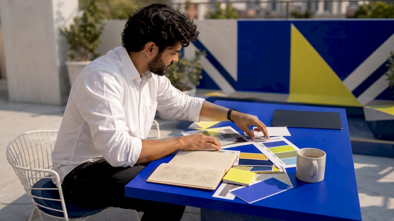
A style tile is a medium-fidelity design artefact that sits between a rough moodboard and a finished design system. It shows real visual decisions without dictating how those decisions will be arranged on a page. That distinction matters enormously. Clients and stakeholders can respond to colour, type, and button styles far more confidently than they can respond to a blank brief or a vague Pinterest board.
A well-built style tile includes the following core elements:
- Primary and secondary colour palettes. These are the exact hex or RGB values your brand will use, not approximations. Colour is the fastest signal of brand personality, so locking it in early prevents costly changes later.
- Typography pairings. A headline font paired with a body font, shown at multiple weights and sizes. This gives every team member a clear reference for how text should feel across the product.
- Interactive UI components. Buttons in default, hover, and disabled states; form inputs; links. These show how the brand personality translates into functional interface elements.
- Iconography samples. A small set of icons that match the visual tone, whether that is geometric, rounded, or illustrated.
- Imagery or texture direction. A mood reference for photography style or background textures, without committing to specific images.
Each element earns its place because style tiles show real interface components that convey mood and brand personality more concretely than a moodboard ever could. A moodboard might show a photograph of a Scandinavian kitchen to suggest “clean and minimal.” A style tile shows the actual grey you will use, the actual sans-serif font, and the actual button shape. That specificity is what makes the conversation productive.
Pro Tip: When choosing a colour palette, test your primary colour against both white and dark backgrounds before committing. A colour that looks confident on a white slide can feel flat on a dark UI. Catching this at the style tile stage costs nothing. Catching it after development is expensive.
How does a style tile differ from a moodboard or design system?
Designers and marketers often confuse style tiles with moodboards or style guides. They serve different purposes at different stages of a project, and mixing them up creates confusion rather than clarity.
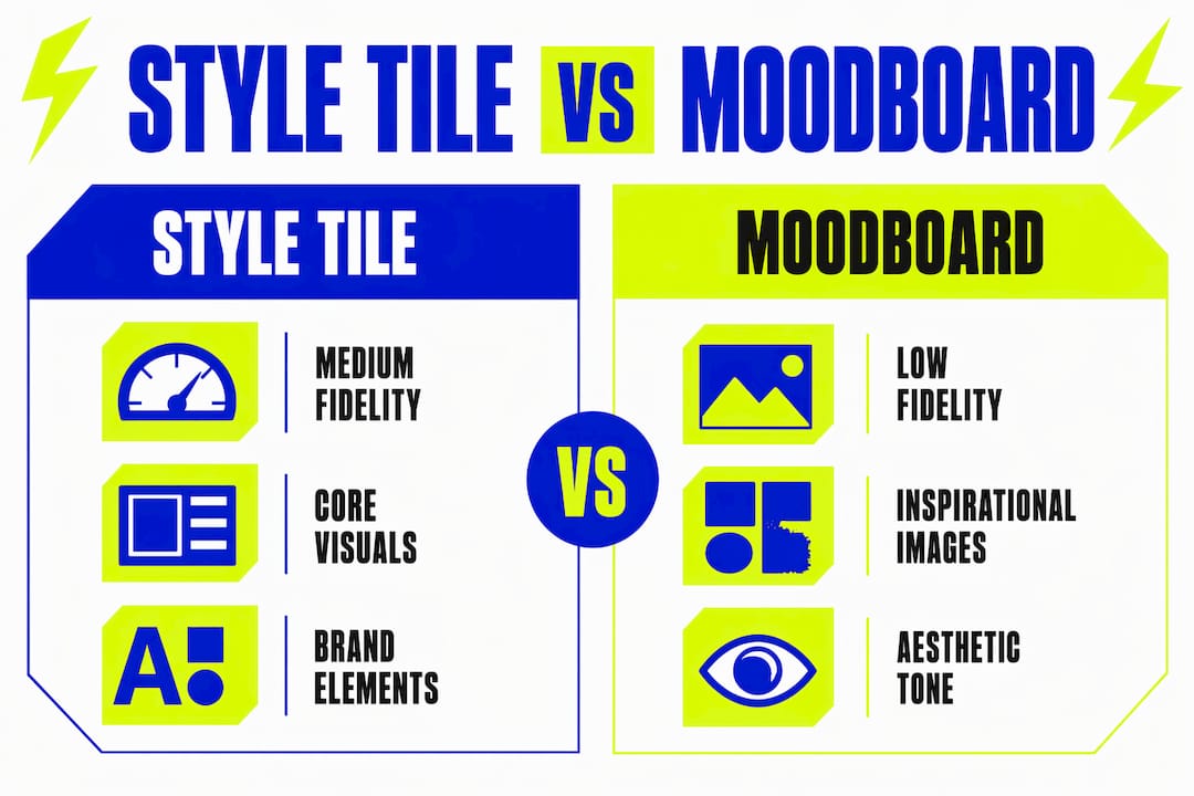
| Artefact | Fidelity | Purpose | Typical use |
|---|---|---|---|
| Moodboard | Low | Establishes aesthetic direction and emotional tone | Early discovery phase |
| Style tile | Medium | Proposes specific visual treatments using real brand elements | Pre-design alignment |
| Style guide | High | Documents agreed visual rules for ongoing use | During and after production |
| Design system | High | Codifies production-ready patterns and components | Development and scaling |
The recommended workflow is moodboard, then style tile, then design system. Skipping the style tile stage and moving directly from a moodboard to high-fidelity mockups frequently leads to costly redesigns and misalignment between what the client imagined and what the designer built. The style tile is the checkpoint that prevents that gap from forming.
A style guide, by contrast, is a document you produce after visual decisions are agreed. It records those decisions for future reference. A design system goes further still, packaging components into reusable code. The style tile is not trying to do either of those jobs. Its job is to get everyone to agree on the visual direction before any of that production work begins.
How do you create a style tile effectively?
Creating a style tile is a collaborative process, not a solo design exercise. Successful projects follow four key stages: gathering requirements, distilling visual directions, creating variations, and iterating to consensus. Each stage has a clear purpose.
- Gather requirements. Start with a structured brief. Ask the client about their audience, competitors they admire, brands they dislike, and the three words they want their brand to communicate. This input shapes every visual decision that follows.
- Distil visual directions. From the brief, identify two or three distinct visual territories. One might lean towards bold and energetic. Another might be calm and authoritative. These territories become the basis for your variations.
- Create two to five variations. Produce multiple style tiles, each representing a different visual direction. Time required varies from one to two days depending on the number of feedback rounds. Presenting options gives clients genuine choice and prevents the conversation from becoming a guessing game.
- Collect feedback and iterate. Present each variation clearly, explaining the thinking behind each choice. Invite specific feedback on individual elements rather than overall impressions. Then refine until one direction earns consensus.
The most common mistake at this stage is treating the style tile as a near-final product. Clients sometimes fixate on a font choice or a button colour as though it is already decided. Your job is to frame the style tile as a visual playground rather than a blueprint. It is a space for exploration, not a commitment.
Pro Tip: When presenting style tile variations to a client, label each one with a descriptive name rather than a number. “The Bold Direction” and “The Considered Direction” give clients a mental hook. “Option 1” and “Option 2” invite arbitrary preference rather than considered feedback.
Presenting style tiles well is a skill in itself. Kukoocreative covers this in detail in its guide on presenting design concepts, which walks through how to frame visual choices so clients respond with useful, specific input rather than gut reactions.
Why do style tiles matter for branding and UI projects?
Style tiles do practical work across the entire project lifecycle. Their value is not limited to the approval stage. They continue to function as a reference point throughout UI development and brand identity work.
- Visual consistency across touchpoints. A style tile agreed early means every designer on the team works from the same colour values, type scales, and component styles. Consistency across a website, app, and marketing materials becomes far easier to maintain.
- Reduced miscommunication. Words like “modern,” “minimalist,” or “premium” mean different things to different people. A style tile replaces those subjective design terms with concrete visual references that everyone can point to.
- Alignment between designers and marketing teams. Marketing teams need to know how a brand looks before they can brief photographers, commission copy, or plan campaigns. A style tile gives them that reference without waiting for a finished website.
- Fewer costly redesigns. Style tiles enable designers and marketing teams to align on visual branding and minimise the risk of late-stage changes. Agreeing on a button colour at the style tile stage is a five-minute conversation. Agreeing on it after a developer has built fifty components is a project delay.
Strong visual storytelling depends on a consistent visual language, and style tiles are the most efficient way to establish that language before production begins. They are also a natural entry point for building a full style guide, which takes the agreed decisions from the style tile and documents them for long-term use.
Key takeaways
Style tiles are the most efficient tool for aligning designers, marketers, and clients on visual brand direction before any layout or development work begins.
| Point | Details |
|---|---|
| Core definition | A style tile presents colours, typography, and UI components to establish a shared visual language. |
| Correct fidelity | Style tiles sit between moodboards and design systems, showing real brand elements without page layouts. |
| Recommended workflow | Follow the sequence: moodboard, then style tile, then design system to avoid costly redesigns. |
| Collaboration tool | Create two to five variations and iterate with stakeholder feedback before agreeing on a direction. |
| Ongoing reference | Use the agreed style tile as a reference point throughout UI development and marketing production. |
Why I think style tiles are underused in branding work
Most designers I speak with understand what a style tile is. Far fewer use one consistently. The honest reason is that style tiles feel like extra work when a client is eager to see “the real thing.” That pressure is real, but giving in to it is almost always a mistake.
The clients who skip the style tile stage are the same clients who ask for significant changes at the mockup stage. By that point, the designer has invested days in a direction that was never properly agreed. The style tile is not a luxury step. It is the step that makes every subsequent step faster and cheaper.
What I find most valuable about style tiles is how they change the quality of client feedback. When you show a full mockup, clients respond to everything at once: the layout, the images, the copy, and the colours. When you show a style tile, they can only respond to the visual language. That focus produces better decisions. It also builds client confidence, because they feel genuinely involved in shaping the brand rather than simply approving or rejecting a finished design.
The other misconception worth addressing is that style tiles are only for digital projects. They work equally well for print, packaging, and brand identity work where no screen is involved. Any project that requires a shared visual language benefits from one.
— Kukoo
Build a brand identity that works from the ground up
At Kukoocreative, we have spent over a decade helping business owners create brand identities that connect with the right people and hold together across every touchpoint.
Style tiles are one of the tools we use to make sure your visual direction is agreed and confident before any design work is finalised. Whether you are starting a new brand or refreshing an existing one, getting the visual language right at the start makes everything else easier. Explore how logo design shapes brand identity and see our design portfolio to get a feel for the kind of work we produce. When you are ready to talk, we are here.
FAQ
What is a style tile in design?
A style tile is a medium-fidelity design document showing a project’s colours, typography, and UI components to establish a shared visual brand direction. It is produced before any page layouts are created.
How is a style tile different from a moodboard?
A moodboard sets an emotional and aesthetic tone using reference images, while a style tile presents actual brand elements such as specific fonts, hex colours, and button styles. Style tiles are more concrete and directly usable in production.
What should a style tile include?
A style tile should include primary and secondary colour palettes, headline and body typography pairings, interactive UI components, icon samples, and imagery or texture direction.
How long does it take to create a style tile?
Creating a style tile typically takes one to two days, depending on the number of variations produced and the rounds of client feedback required.
When should you use a style tile in a project?
Use a style tile after the initial moodboard phase and before any high-fidelity mockups or development work begins. This is the stage where visual direction is agreed with stakeholders.