
TL;DR:
- A landing page is a single-purpose web page designed to convert visitors from a specific campaign. It focuses on one clear action, such as filling a form or making a purchase, without navigation distractions. Proper messaging, a single CTA, and measuring performance are essential for maximizing conversions.
A landing page is a standalone, single-purpose web page built to convert visitors from a specific campaign. Unlike a homepage, it has one job: to get the visitor to take one action, whether that is downloading a free guide, booking a demo, or clicking through to buy. As Adobe Business UK notes, landing pages fall into two broad categories: lead generation pages that capture contact details and click-through pages that push visitors toward a purchase or next step. A typical CTA might read “Download your free pricing guide” or “Book your free 30-minute call.” The key difference from a regular website page is the absence of navigation menus and competing links. Every element on the page points in one direction.
Table of Contents
- What does a high-converting landing page actually contain?
- What types of landing pages should you use?
- How does a landing page differ from a homepage?
- Why do landing pages matter for UK businesses?
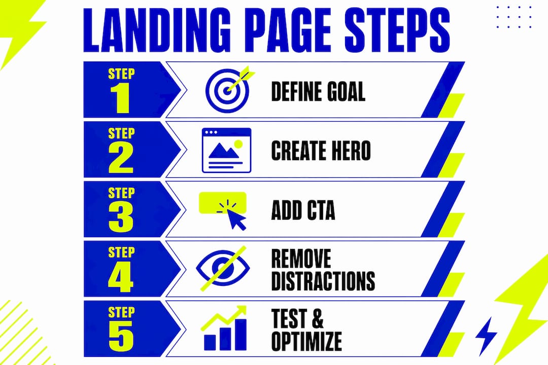
- How do you create a landing page? A step-by-step checklist
- How do you optimise a landing page and run effective tests?
- Three landing page templates you can adapt today
- Key takeaways
- What most businesses get wrong about landing pages
- Kukoocreative can build your landing page from brief to live
- Useful resources for building and testing landing pages
What does a high-converting landing page actually contain?
The components of a landing page are not arbitrary. Each one earns its place by moving the visitor closer to the single conversion goal.
- Headline: The first thing a visitor reads. It must match the promise of the ad or email that brought them there. Example: if your Google ad says “Free brand audit for Leeds businesses,” your headline should say the same thing, not something generic like “Welcome to our services.”
- Subheadline: One sentence that expands on the headline’s promise and adds a reason to stay.
- Hero image or visual: A strong visual that reinforces the offer. For a service business, a clean mockup or a confident team photo works better than a stock image of a handshake.
- Single dominant CTA: One button, one action. Removing distractions and aligning the page to the ad’s promise increases conversion likelihood significantly.
- Form (for lead generation pages): Ask only for what you genuinely need. Name and email is usually enough to start a conversation.
- Trust signals: Client logos, testimonials, accreditations, or review scores. These reduce hesitation at the moment of decision.
- Supporting benefits: Three to five short bullet points that answer “why should I do this?”
- Minimal footer: A privacy policy link and legal name. Nothing more. No full site navigation.
Visual hierarchy matters here. The visitor’s eye should travel from hero to value proposition to CTA without detours. Think of it as a single persuasive path, not a menu.
Pro Tip: Match your headline to the exact language of your ad or email subject line. This “message match” is one of the highest-impact, lowest-cost improvements you can make to any landing page.

What types of landing pages should you use?
Choosing the right type comes down to where your visitor is in the buying process and what action you want them to take.

Lead generation pages capture contact information in exchange for something valuable. A lead gen page might offer an ebook, a free audit, or a pricing breakdown. The visitor fills in a form; you follow up. These work well at the top and middle of the funnel, particularly for B2B services where a sale requires a conversation first.
Click-through pages warm the visitor up before sending them to a checkout or booking page. A product-specific landing page for a flash sale, for example, might describe the offer in detail and then push the visitor to a payment screen with a single button. There is no form; the CTA is the entire mechanism.
Event and microsite pages serve a single campaign moment: a product launch, a workshop, or a seasonal promotion. They live for the duration of the campaign and are then retired or repurposed.
Micro landing pages are worth knowing about if you run niche campaigns. A micro landing page focuses on a tightly scoped offer for a very specific audience segment, boosting relevance and conversion for creator-driven or hyper-targeted promotions.
The simple rule: if you need data, use a lead generation page. If you need a click, use a click-through page. If your campaign is time-limited or audience-specific, consider a microsite or micro page.
How does a landing page differ from a homepage?
Sending paid traffic to your homepage is one of the most common and costly mistakes in digital marketing. A homepage is designed for browsing. A landing page is designed for converting. They serve genuinely different purposes, and confusing the two costs you money on every campaign.
The core distinction is focus. A homepage must serve every type of visitor: new prospects, returning customers, job seekers, journalists. A landing page serves one visitor with one goal at one moment in time.
| Feature | Homepage | Campaign landing page |
|---|---|---|
| Navigation | Full site menu | None (or minimal) |
| Number of CTAs | Multiple | One |
| Primary goal | Inform and explore | Convert a specific action |
| Success metric | Pages per visit, time on site | Conversion rate |
The removal of navigation is not a design preference. It is a conversion decision. Every link you add to a landing page is an exit route. Fewer exits mean more conversions.
For a deeper look at how single-page and multi-page structures differ, the guide on multi-page websites explains the trade-offs clearly.
Why do landing pages matter for UK businesses?
A landing page gives you something a homepage cannot: clean, attributable measurement. When a visitor arrives from a specific ad and converts on a page built for that ad alone, you know exactly what worked. That clarity is the foundation of sensible campaign spending.
The practical benefits for a UK small business are direct. You can run a Google Ads campaign for a specific service, send traffic to a dedicated page, and measure cost per lead with confidence. Without a dedicated page, your conversion data is muddied by organic visitors, homepage browsers, and people who came looking for something else entirely.
The key performance indicators (KPIs) worth tracking are:
- Conversion rate: The percentage of visitors who complete the desired action. This is the primary success metric for any landing page, not time on page or pages per visit.
- Cost per acquisition (CPA): How much you spend in ad budget to generate one lead or sale.
- Leads generated: The raw volume of contacts captured in a given period.
A Leeds-based accountancy firm running a Google Ads campaign for “self-assessment tax returns” would see a far better return sending traffic to a page that says “Book your self-assessment consultation” than to a homepage that also features payroll services, company accounts, and a blog. The offer is specific; the page should be too.
How do you create a landing page? A step-by-step checklist
Building a landing page well takes less time than most people expect, but it does require a clear sequence. Here is the process Kukoocreative uses with UK clients, with realistic time and cost estimates for small businesses.
- Define the offer and audience: What is the single action you want the visitor to take? Who is the visitor? What do they already know? Write this down before touching any design tool.
- Write the copy first: Headline, subheadline, benefits, CTA text, and form labels. Copy drives conversion more than design. If you need support here, professional copywriting makes a measurable difference to results.
- Wireframe the layout: Sketch the page structure on paper or in Figma. Confirm the visual hierarchy: hero → value → CTA.
- Design the page: Apply brand colours, typography, and imagery. Keep it clean. Clutter kills conversion.
- Build and publish: See tool guidance below.
- QA and test: Check on mobile, test the form submission, confirm the thank-you page fires correctly, and verify your analytics tracking is live.
- Connect tracking: Set up a conversion goal in Google Analytics 4 or your ad platform. Without this, you are flying blind.
Ballpark costs for UK small businesses:
- DIY with a builder tool: £0–£50/month (tool subscription only)
- Freelance designer/developer: £300–£800 per page
- Agency-built, bespoke: £800–£2,500+ depending on complexity
These are ballpark estimates. Costs vary by brief, integrations required, and whether copy is included.
Recommended tools:
- Unbounce: Purpose-built for landing pages, with strong A/B testing and well-reviewed by marketers. Best for teams running multiple campaigns.
- Mailchimp: Good for small businesses already using it for email. Landing page functionality is included in paid plans and connects directly to your mailing list.
- WordPress: The most flexible option if you already have a WordPress site. Use a page builder like Elementor or Beaver Builder for speed. Best when you want full control and own your data.
For a full walkthrough of the build process, the Kukoocreative guide on how to create a landing page covers conversion-focused elements in detail.
Pro Tip: Keep your form to three fields or fewer for top-of-funnel campaigns. For B2B, capture only the data that allows you to qualify the lead immediately: name, email, and company size is usually sufficient. Every extra field reduces completion rates.
How do you optimise a landing page and run effective tests?
Publishing a landing page is the start, not the finish. The pages that perform best are the ones that get tested and refined over time.
Start with these optimisation checks before running any formal test:
- Message match: Does your headline mirror the ad or email that drove the click? Mismatches between ad copy and page copy are the single most common cause of high bounce rates.
- Load speed: A slow page loses visitors before they read a word. Use Google PageSpeed Insights to check your score, particularly on mobile.
- Form friction: Count your form fields. If you have more than four, ask which ones you could remove without losing qualification data.
- CTA clarity: Is the button text specific (“Download the free guide”) or vague (“Submit”)? Specific CTAs consistently outperform generic ones.
- Mobile usability: Check the page on at least two different screen sizes. The CTA button must be thumb-friendly and visible without scrolling.
For a broader conversion checklist, the converting website checklist from Kukoocreative covers many of the same principles.
Running A/B tests properly
An A/B test changes one element at a time: the headline, the CTA colour, the hero image, or the form length. Test one variable per experiment, or you will not know what caused the result. Run the test until you have enough visitors to draw a reliable conclusion. As a rough guide, aim for at least 100 conversions per variant before calling a winner. Duration matters too: run tests for a minimum of two weeks to account for day-of-week variation in traffic behaviour.
Track conversion rate as your primary KPI. Secondary metrics like CPA and form completion rate add context. A lift of even two to three percentage points on a paid campaign can meaningfully reduce your cost per lead over a month of spend.
For guidance on CTA placement specifically, the CTA placement guide is worth bookmarking alongside your optimisation work.
Three landing page templates you can adapt today
These three outlines give you a starting structure for the most common campaign types. Adapt the micro-copy to your offer and audience.
Lead magnet template
Structure: Headline → one-sentence subheadline → three benefit bullets → form → trust signal
- Headline: “Get the [specific result] guide — free for UK businesses”
- Subheadline: “Download in 30 seconds. No spam, just practical advice.”
- CTA button: “Send me the guide”
- Trust signal: A client logo row or a short testimonial from a named customer
- Imagery: A clean mockup of the guide cover or a relevant illustration
- GDPR note: Include a single line beneath the form: “By submitting, you agree to our [Privacy Policy link]. We will not share your data with third parties.” This is the minimum required for UK businesses collecting personal data under UK GDPR.
Demo booking template
Structure: Headline → value proposition → short benefit list → calendar embed or form → social proof
- Headline: “See [product/service] in action — book a 20-minute demo”
- Subheadline: “No obligation. We will show you exactly how it works for businesses like yours.”
- CTA button: “Book my demo”
- Trust signal: Company logos of existing clients, or a star rating with review count
- Imagery: A screenshot of the product or a photo of the team
Flash sale template
Structure: Offer headline → urgency element → product image → CTA → minimal trust signal
- Headline: “Discounted [product] — this weekend only”
- Subheadline: “Order by Sunday midnight. Delivered quickly across the UK.”
- CTA button: “Claim my discount”
- Trust signal: A short returns policy note and a secure payment badge
- Imagery: A strong product photo on a clean background
For all three templates, keep navigation links off the page entirely. A privacy policy link in the footer is sufficient for legal compliance. If you are collecting email addresses, your consent language must be clear, specific, and unticked by default under UK GDPR rules.
Key takeaways
A landing page works because it removes every distraction and aligns the page’s single promise with the visitor’s single intent, making conversion the only logical next step.
| Point | Details |
|---|---|
| Single purpose wins | One page, one CTA, one goal — removing navigation and competing links is a conversion decision, not a design preference. |
| Message match is critical | Your headline must mirror the ad or email that drove the click; mismatches are the most common cause of high bounce rates. |
| Conversion rate is the KPI | Track conversion rate as your primary metric, not time on page or pages per visit. |
| Test one variable at a time | Run A/B tests with at least 100 conversions per variant and a minimum two-week duration before calling a winner. |
| Kukoocreative builds bespoke landing pages | For UK businesses wanting a professionally designed, conversion-focused page, Kukoocreative handles brief, design, build, and tracking setup. |
What most businesses get wrong about landing pages
The most persistent mistake is treating a landing page as a short homepage. A business will spend money on Google Ads, drive traffic to a page with a navigation bar, three different CTAs, and a footer full of links, and then wonder why the campaign is not converting. The page is not failing because the offer is bad. It is failing because the visitor has too many choices.
There is also a tendency to over-engineer the form. A B2B business will ask for job title, company size, annual revenue, phone number, and preferred contact time on a top-of-funnel page where the visitor has never heard of them. That level of friction is appropriate for a late-stage demo request, not for a first-touch lead magnet. The principle here is worth taking seriously: capture only the data that allows you to qualify the lead and map it to a defined follow-up process. Everything else can wait.
The third mistake is publishing and forgetting. A landing page without a conversion goal set up in Google Analytics 4 is just a web page. You cannot improve what you are not measuring.
For UK businesses commissioning a landing page from an agency, the most useful thing you can do before the first briefing call is write down the single action you want the visitor to take, the one sentence that describes your offer, and the three reasons a visitor should trust you. Bring those three things to the brief and the build will be faster, cheaper, and more effective.
Kukoocreative can build your landing page from brief to live
If you have read this far, you already know what a good landing page needs. The harder part is building one that looks credible, loads fast, and actually converts. That is where Kukoocreative comes in.
We work with UK businesses, particularly in Leeds and across the North, to design and build landing pages that are conversion-focused from the first wireframe. No bloated templates, no generic stock photography, no forms that ask for twelve fields when three will do. We handle the brief, the copy structure, the design, the build, and the tracking setup, so you get a page that is ready to run traffic from day one.
Want to see what that looks like in practice? Browse the Kukoocreative portfolio to see recent design and web work, or read through the web design process guide to understand exactly how we work with UK clients from brief to launch. When you are ready to talk, get in touch and we will take it from there.
Useful resources for building and testing landing pages
| Resource | What it is for |
|---|---|
| Unbounce (G2 reviews) | Read verified user reviews before choosing Unbounce as your landing page builder |
| Adobe Business UK: What is a landing page? | Authoritative definition and overview of landing page types and best practices |
| PPC Geeks: Lead generation landing pages | Practical UK-focused guide to building lead gen pages that convert |
| Directive UK: Lead gen landing page blueprint | B2B-specific guidance on form design and pipeline qualification |
| Impact SEO: Landing page glossary | Clear definition of landing page KPIs including conversion rate as the primary metric |
| lflow: Micro landing page guide | When and how to use micro landing pages for niche or creator-driven campaigns |
| lflow: CTA links explained | How to structure and track CTA links effectively within landing page campaigns |
| Wikipedia: Landing page | Background reference on the history and technical definition of landing pages |