A strong logo can increase brand recognition by as much as 80 percent. In a crowded marketplace, your logo is not just decoration—it is the first handshake with every customer. Crafting a mark that is simple, versatile, and unforgettable gives your business the edge from day one. This guide breaks down proven design strategies so your logo stands out and leaves a lasting impression no matter where it appears.
Table of Contents
- 1. Keep Your Logo Simple And Memorable
- 2. Choose Colours That Reflect Your Brand
- 3. Use Fonts That Are Clear And Readable
- 4. Design For Flexibility Across All Media
- 5. Make Sure Your Logo Works In Black And White
- 6. Ensure Your Logo Is Scalable For Any Size
- 7. Avoid Design Trends That Fade Quickly
Quick Summary
| Takeaway | Explanation |
|---|---|
| 1. Keep Your Logo Simple and Memorable | A simple logo enhances brand recognisability and impact, ensuring instant recall. |
| 2. Choose Colours That Reflect Your Brand | Select colours based on audience and industry norms to strengthen emotional connection. |
| 3. Use Clear and Readable Fonts | Ensure fonts are legible at all sizes, reflecting your brand’s personality effectively. |
| 4. Design for Flexibility Across All Media | Create adaptable logo versions to maintain clarity on various platforms and formats. |
| 5. Avoid Fleeting Design Trends | Focus on timeless design principles to ensure your logo remains relevant for years. |
1. Keep Your Logo Simple and Memorable
Your logo is the visual heartbeat of your brand. It is the first impression customers have of your business and needs to communicate your essence quickly and powerfully. According to research from the University of Sussex, a centered and uncluttered logo design ensures strong visual impact and memorability.
Simplicity transforms logos from forgettable graphics into memorable brand signatures. Think about some of the most recognisable logos worldwide: Apple, Nike, McDonald’s. What do they share? Clean lines, minimal elements, and instant recognisability. These brands understand that complexity dilutes message while simplicity amplifies communication.
To create a simple yet powerful logo, focus on these key principles:
- Limit colour palette: Choose 1 or 2 complementary colours
- Minimise details: Remove unnecessary graphic elements
- Use clean typography: Select fonts that are readable at multiple sizes
A landmark study from University of Arts London emphasises that a simple and distinctive logo dramatically enhances corporate image and reputation by improving recognisability among consumers. Your logo should work equally well whether it’s on a business card or a billboard.
Remember: Great logos are not about complexity. They’re about clarity, instant recognition, and emotional connection. Your logo should tell your brand’s story at a glance.
2. Choose Colours That Reflect Your Brand
Colour is the silent language of your brand. It communicates emotions, values, and personality before a single word is read. Research on generative adversarial networks from ArXiv underscores the critical importance of colour conditioning to align logos with brand identity.
Understanding colour psychology is key to selecting the right palette for your logo. Different colours evoke distinct emotional responses. Blue suggests trustworthiness and professionalism. Green represents growth and sustainability. Red signals energy and passion. Yellow communicates optimism and creativity.
When choosing your brand colours, consider these strategic approaches:
- Know your audience: Select colours that resonate with your target demographic
- Understand industry norms: Research colour trends in your specific business sector
- Test for consistency: Ensure colours look good across digital and print platforms
In the brand identity guide for UK businesses, we explore how colour selections can dramatically impact brand perception. Your colour choices are not just aesthetic decisions. They are strategic communications that speak directly to potential customers.
Remember: Authentic colour selection transforms a logo from a mere graphic into a powerful brand storytelling tool.
3. Use Fonts That Are Clear and Readable
Your logo font is the voice of your brand. It speaks volumes before a single word is read. According to the International Society of Typographic Designers, maintaining high standards in typography is crucial for effective communication.
Choosing the right font is about balancing personality with practicality. A great logo font should be legible at multiple sizes whether printed on a business card or displayed on a massive billboard. This means avoiding overly decorative or complex typefaces that might look stylish but sacrifice readability.
When selecting your logo font, consider these critical guidelines:
- Prioritise legibility: Choose fonts that remain clear at different scales
- Match brand personality: Select typography that reflects your business character
- Limit font complexity: Stick to clean simple typefaces
The University of Oxford’s design guidelines emphasise the paramount importance of clear typography to effectively convey your intended message. Your font is not just a visual element. It is a strategic communication tool that represents your brand’s core identity.
Pro tip: Always test your chosen font across multiple platforms and sizes to ensure consistent performance and readability.
4. Design for Flexibility Across All Media
In today’s digital world, your logo needs to perform brilliantly everywhere. From tiny mobile screens to massive billboard displays, your visual identity must remain sharp and recognisable. University of Manchester’s digital guidance emphasises the critical importance of creating adaptable logo designs.
Flexibility means your logo must look equally impressive whether it is printed in black and white, displayed on a dark background, scaled down for a business card, or blown up for a storefront sign. This requires strategic design thinking that goes beyond initial aesthetic appeal.
To ensure your logo remains versatile, consider these essential strategies:
- Create multiple versions: Develop horizontal, vertical, and compact logo variations
- Use vector formats: Ensure your logo can be scaled without losing quality
- Test across platforms: Verify logo performance on digital and print media
According to English UK’s brand identity guidelines, maintaining logo consistency is paramount. Your visual identity should communicate the same core message whether it appears on a smartphone app, corporate letterhead, or social media profile.
Remember: A truly great logo is not just a design. It is a flexible brand ambassador that represents your business across every possible medium.
5. Make Sure Your Logo Works in Black and White
A truly exceptional logo transcends colour. It communicates your brand essence even when stripped down to its most fundamental form. Oxford’s guidelines recommend designing logos that remain effective without colour, ensuring clarity and impact across all formats.
Black and white versatility is not just a technical requirement. It is a test of your logo’s fundamental design strength. Imagine your logo being faxed, printed in a newspaper, or reproduced on a monochrome document. Can it still capture attention and represent your brand powerfully?
To ensure your logo performs brilliantly in black and white, focus on these key design principles:
- Prioritise shape and contrast: Create designs with strong visual differentiation
- Avoid complex gradients: Use solid shapes and clear outlines
- Test multiple backgrounds: Verify logo readability on light and dark surfaces
The University of Sussex advises that logos must maintain their visual impact and readability even when reproduced without colour. This means your design should rely on form and structure rather than colour to communicate its message.
Remember: A great logo is not about how it looks in full colour. It is about how effectively it communicates your brand story in any context.
6. Ensure Your Logo Is Scalable for Any Size
Your logo is a chameleon that must look stunning whether it is displayed on a tiny business card or a massive billboard. English UK’s guidelines emphasise establishing minimum reproduction sizes to guarantee clarity and recognizability.
Scalability is about maintaining visual integrity across diverse platforms. Your logo should remain crisp and legible whether printed on a promotional pen or displayed on a giant digital screen. This requires strategic design thinking that goes beyond initial aesthetic appeal.
To create a truly scalable logo, consider these essential strategies:
- Use vector graphic formats: Ensures infinite scaling without quality loss
- Simplify complex details: Remove intricate elements that might blur at smaller sizes
- Create multiple logo variations: Develop compact and expanded versions
The University of Manchester’s digital standards highlight the importance of maintaining logo proportions and clarity across different digital applications. A well designed logo adapts seamlessly without losing its core visual identity.
Remember: Your logo is a visual ambassador that must look professional and recognisable whether it is microscopic or massive.
7. Avoid Design Trends That Fade Quickly
Today’s cutting edge design is tomorrow’s dated visual cliché. Oxford’s guidelines wisely suggest focusing on distinctive and appropriate design elements that transcend fleeting trends to create enduring logos.
Design trends are seductive. That swirling geometric pattern or neon colour gradient might look fresh right now. But in two years? Your logo could look embarrassingly outdated. Great logos are timeless visual signatures that communicate your brand’s core identity without being prisoners to momentary aesthetic whims.
To create a logo with lasting appeal, consider these strategic approaches:
- Prioritise classic design principles: Focus on clean lines and fundamental shapes
- Study iconic logos: Learn from brands with decades of visual consistency
- Resist overcomplicating design: Simplicity always outlasts complexity
Your logo is a long term investment. It should represent your business with dignity and professionalism for years perhaps decades to come. While design trends will continuously shift your logo needs to remain a consistent beacon of your brand identity.
Remember: A truly great logo does not follow trends. It sets them.
Below is a comprehensive table summarising the main strategies and principles discussed throughout the article on effective logo design.
| Aspect | Guidelines | Benefits |
|---|---|---|
| Logo Simplicity | Use minimal elements, limit colour palette, and choose clean typography. | Enhances memorability and recognisability. |
| Colour Choice | Align with brand identity using psychological insights. | Reflects brand personality and communicates values. |
| Typography | Select clear, legible fonts suitable for all sizes. | Ensures readability and conveys brand character. |
| Design Flexibility | Create adaptable designs for various media. | Maintains consistency and brand integrity across platforms. |
| Black & White Effectiveness | Focus on shape and contrast; avoid gradients. | Guarantees clarity and impact without colour. |
| Scalability | Utilise vector formats and simplify details. | Preserves clarity across sizes and applications. |
| Avoiding Trends | Focus on timeless design principles. | Ensures long-term brand appeal and consistency. |
Elevate Your Brand with Timeless Logo Design Solutions
Creating a simple, scalable and emotionally resonant logo is a challenge many UK business owners face. The article highlights the importance of clarity, colour psychology and versatility to build instant recognition and long-term brand strength. If you feel overwhelmed by design trends that fade quickly or unsure how to make your logo work seamlessly across every medium, you are not alone. Achieving a logo that truly embodies your brand’s personality and stands the test of time demands expert guidance.
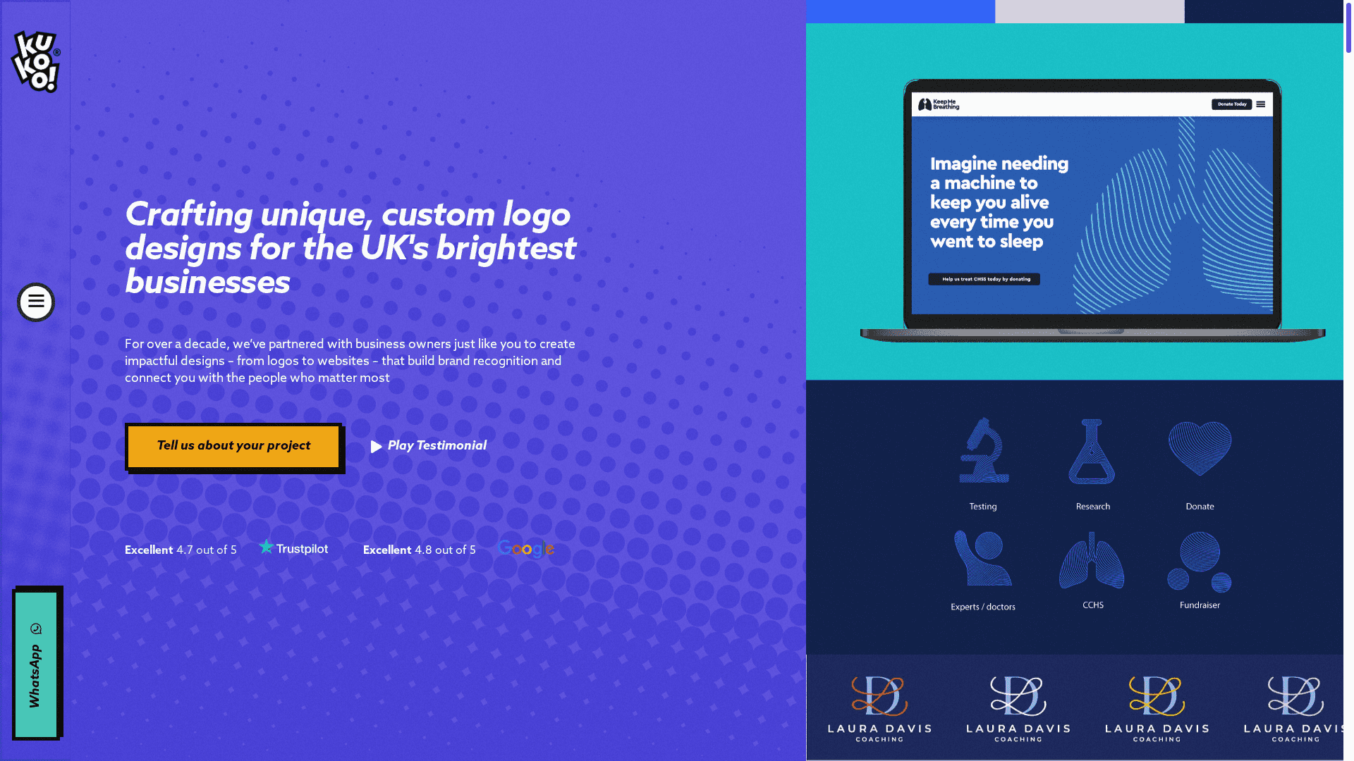
At Kukoo Creative, we have partnered with businesses like yours for over a decade to craft logos and visual identities that connect deeply with your audience. We focus on powerful simplicity, consistent colour stories and clear typography to deliver logos that perform brilliantly in black and white as well as full colour. Our approach ensures your brand looks professional from the smallest screen to the largest billboard.
Wondering how to make your brand story visible at a glance and build recognition that lasts?
Discover how we can bring your unique vision to life with design strategies rooted in proven best practices. Visit Kukoo Creative today and start creating a logo that truly represents you. Your brand deserves clarity and impact that never fades.
Frequently Asked Questions
How can I create a simple and memorable logo for my business?
To create a simple and memorable logo, focus on limiting your colour palette to 1 or 2 complementary colours and minimising unnecessary details. Remove distracting graphic elements and select clean, readable typography to ensure instant recognisability.
What colours should I choose for my logo to reflect my brand identity?
Choose colours that resonate with your target audience and align with your brand values. For example, if your business is focused on sustainability, consider using green to convey growth and eco-friendliness.
How do I ensure my logo font is clear and readable?
Select a font that is legible at various sizes and reflects your brand personality. Always test the chosen font across different platforms, ensuring it remains clear whether on a business card or a billboard.
Why is it important for my logo to work in black and white?
A logo that looks good in black and white demonstrates strong design fundamentals. Focus on shape and contrast to ensure that your logo communicates effectively even without colour.
What steps can I take to make my logo scalable?
Use vector graphic formats for your logo to ensure it scales without losing quality. Simplify complex details and create multiple logo variations to maintain clarity across different media, from business cards to large displays.
How can I avoid following design trends that fade quickly?
Focus on classic design principles and study timeless logos to inform your choices. Prioritise clean lines and simple shapes, avoiding overly trendy elements that might not stand the test of time.
Recommended
- Business Card Design – 7 Rules of an Effective Business Card Design
- Quick Steps for the Perfect Logo Design UK – Kukoo Creative
- Why Branding Matters: Complete Guide For UK Business Owners – Kukoo Creative
- Logo Design | Top 12 Businesses That Need Killer Logo Design
- Building a Strong Online Presence: A Step-by-Step Guide for Small Businesses – Digital Marketing Agency – Market Link Solutions
- 7 Essential Signage Design Tips for Business Success –