
TL;DR:
- A mood board is a visual tool that communicates a project’s style and tone before design work begins. It helps align clients and designers, reducing costly revisions by providing shared references for brand qualities. Creating an effective mood board involves filtering images through core brand adjectives and explaining each element’s strategic purpose.
A mood board is defined as a curated visual compilation that communicates the style, tone, and direction of a project before any design work begins. It is not a random collage. It is a strategic tool that makes abstract concepts like “trustworthy” or “bold” tangible through colour, typography, and imagery. Professional design agencies report that using mood boards at the start of a project significantly reduces costly “this doesn’t feel right” feedback loops later. For creatives and business professionals alike, understanding what a mood board is and how to use one well is one of the most practical skills you can develop.
What are the main benefits of a mood board in design projects?
A mood board acts as a visual argument. It shifts the client and designer relationship from subjective opinion to shared, strategic alignment. Rather than debating whether a colour “feels right,” both parties can point to a concrete reference and discuss it objectively.
The practical benefits are significant:
- Alignment before commitment. Mood boards surface disagreements early, when changes cost nothing.
- Shared vocabulary. They give clients and designers a common language for discussing tone and style.
- Faster approvals. When direction is agreed upfront, revision rounds shrink considerably.
- Reduced misaligned expectations. Clients see the visual territory before a single concept is drawn.
- Stronger creative confidence. Designers work with clarity rather than guesswork.
A well-assembled mood board concretises subjective brand values like “trustworthy” through visual distinctions such as colour and typography. That distinction matters because two designers can interpret “trustworthy” in completely opposite directions without a shared visual reference. Mood boards prevent that drift before it becomes expensive.
Mood boards also support the visual branding workflow by giving every team member, from copywriters to developers, a single reference point for what “on-brand” looks like. That shared understanding speeds up every subsequent decision in the project.
How do you create an effective mood board?
Creating a mood board that actually works requires a clear process. Gathering images at random produces a pretty collage, not a strategic tool. Follow these steps to build one with purpose.
-
Gather broad inspiration first. Start with wide exploration using platforms like Pinterest or saved image folders. Capture anything that feels relevant to the brand or project without filtering yet.
-
Define your core brand adjectives. Choose 3–5 words that describe the brand personality, such as bold, approachable, or future-ready. These become your filter for every image you keep.
-
Filter ruthlessly. Test each image against your adjectives. Using 3–5 core brand adjectives as a filter ensures strategic focus and removes anything that dilutes the message.
-
Add notes to each element. Annotate your choices. Explain why a particular photograph conveys “warmth” or why a typeface communicates “authority.” Notes transform a collection of images into a reasoned argument.
-
Choose your layout with intention. Composition matters. Place the most important elements where the eye lands first. Group related items to show relationships between colour, texture, and type.
-
Present with a narrative. Walk your client through the board element by element. Explain the strategic reasoning behind each choice, not just the aesthetic one.
Pro Tip: Never present a mood board silently. The presentation is where the strategic value is communicated. A board without explanation is just a picture.
Digital vs physical mood boards
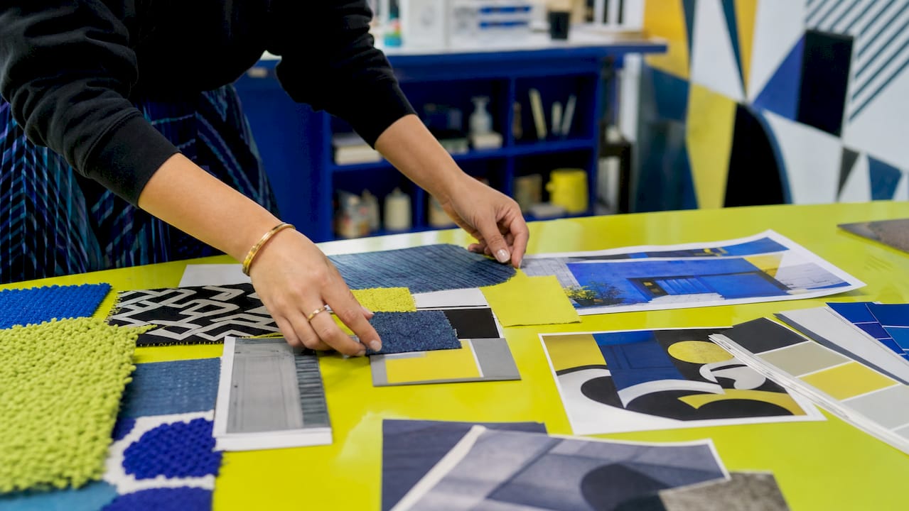
Digital mood boards, built in tools like Figma, Adobe Express, or Canva, are easy to share, update, and present remotely. They suit most branding and UX projects. Physical boards, assembled from printed swatches, fabric samples, and cut-out imagery, work particularly well for interior design, fashion, and tactile product work where material texture matters. For most business branding projects in 2026, a digital format is the practical choice.
Pro Tip: For client presentations, export your digital mood board as a PDF with a one-page narrative summary. It gives clients something to refer back to between meetings.
What key components should a mood board include?
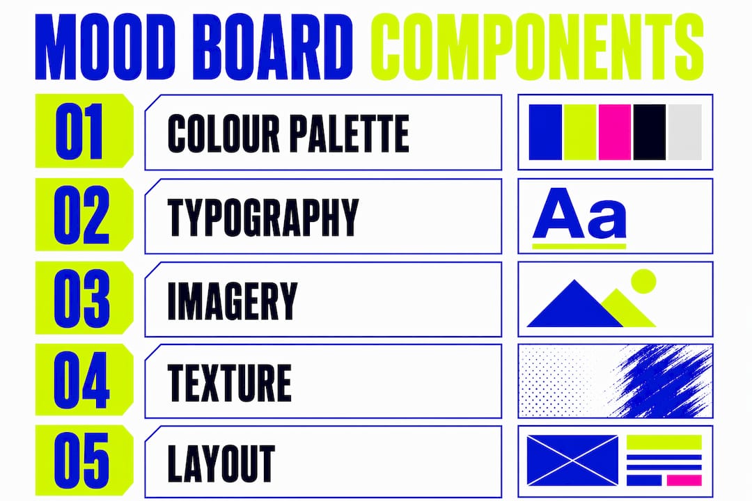
A brand mood board is a single organised canvas that captures personality through colours, typography, imagery, and layout details. Each component carries a specific communicative role.
| Component | Purpose |
|---|---|
| Colour palette | Conveys emotional tone; warm tones suggest energy, cool tones suggest calm or trust |
| Typography | Communicates brand character; serif fonts feel established, sans-serif fonts feel modern |
| Imagery and photography | Sets the visual world and lifestyle context of the brand |
| Texture and pattern | Adds tactile depth and reinforces brand personality through surface quality |
| Layout and composition | Guides the viewer’s eye and demonstrates how elements will work together |
Colour is the fastest communicator on a mood board. A palette of deep navy and gold signals premium quality before a single word is read. Typography reinforces that message. A sharp geometric sans-serif paired with that palette says something quite different from a flowing script. Every element on the board must earn its place by supporting the brand adjectives you defined at the start.
Imagery and texture samples do the heaviest lifting for tone. A photograph of a sunlit café interior conveys “approachable and warm” far more efficiently than a paragraph of copy. That efficiency is precisely why mood boards are so effective at the early stages of a visual identity project.
How are mood boards used in branding and other creative projects?
Mood boards serve as a North Star for design decisions throughout a project. They guide choices on fonts, colours, and visual elements, ensuring every decision connects back to the agreed brand direction rather than individual preference.
In branding, a mood board created at the briefing stage aligns the marketing team, the designer, and the client before any logo concepts are developed. This prevents the common situation where a client approves a brief in words but rejects the design because the visual interpretation was never discussed. Mood boards make that conversation happen at the right moment.
In UX design, mood boards establish the visual language for an interface before wireframes are built. In interior design, they align clients on material choices before costly purchases are made. The application differs, but the function is identical: agree on direction visually before committing resources.
Mood boards are also working documents that evolve during a project, not static collages fixed at the start. As a project develops, the board can be refined to reflect new decisions while maintaining the core direction. This flexibility makes them useful throughout a project lifecycle, not just at the beginning. Interior designers use this same principle to save significant time by establishing shared reference points with clients early.
For brand storytelling, a mood board also anchors the narrative. The visual branding examples that resonate most strongly with audiences are those built from a clear, consistent visual direction established before execution began.
What common mistakes should you avoid with mood boards?
The most damaging mistake is presenting a mood board without explanation. A board full of beautiful images means nothing to a client if they cannot see the strategic reasoning behind each choice. Presenting mood boards with clear reasoning behind every element builds client trust and reduces random revision requests.
Avoid these common pitfalls:
- Collecting without filtering. A mood board with 40 images and no clear thread is not a strategy. It is a Pinterest board. Cut it down to the images that directly support your brand adjectives.
- Prioritising beauty over clarity. A visually stunning board that does not communicate the brand direction has failed its purpose.
- Skipping the annotation. Every image needs a note explaining why it is there. Without notes, clients interpret images through their own lens, not yours.
- Treating it as a one-time deliverable. Mood boards should be revisited as the project evolves to keep decisions anchored.
- Mixing conflicting tones. Including both minimal and maximalist imagery without explanation creates confusion rather than direction.
Pro Tip: Before presenting, ask yourself: “Could a client look at this board and brief a different designer to produce the same result?” If the answer is no, add more annotation and remove ambiguous images.
The goal of a mood board is not to impress. It is to align. Every decision you make in building and presenting it should serve that single purpose.
Key takeaways
A mood board is the most cost-effective alignment tool in any creative project, because it resolves visual disagreements before design work begins.
| Point | Details |
|---|---|
| Definition and purpose | A mood board is a curated visual compilation that communicates style, tone, and direction before design starts. |
| Strategic filtering | Use 3–5 brand adjectives to test every image, keeping only those that directly support the brand personality. |
| Presentation matters | Always explain the reasoning behind each element; a board without narrative is just decoration. |
| Living document | Mood boards evolve throughout a project, maintaining alignment as decisions develop. |
| Reduces costly revisions | Agreeing direction visually upfront prevents misaligned feedback loops later in the project. |
Why mood boards are the most underrated tool in creative business
Mood boards changed how I approach every client project. Before I made them a standard part of the briefing process, I spent far too many hours revising concepts that were technically well-executed but visually wrong for the client’s expectations. The problem was never the design skill. It was the gap between what the client imagined and what I understood from the brief.
The moment I started presenting mood boards before any concept work, that gap closed. Clients who previously struggled to articulate what they wanted could suddenly point to an image and say “yes, that feeling exactly” or “no, that’s too corporate.” That clarity is worth more than any design technique I know.
What surprises most people is that mood boards do not restrict creativity. They do the opposite. When you know the boundaries of the visual territory, you can work with genuine confidence within it. The creative freedom comes from clarity, not from an open brief with no direction.
My honest advice: if you are presenting concepts to clients without a mood board stage, you are taking an unnecessary risk. The time you invest in building and presenting a mood board is returned many times over in fewer revisions and stronger client relationships. At Kukoocreative, this stage is built into every branding and logo project we take on, and it is consistently the step clients value most.
— Kukoo
How Kukoocreative uses mood boards to build brands that last
At Kukoocreative, mood boards are not an optional extra. They are built into the briefing process for every logo and brand identity project we deliver.
Before any concept is developed, we establish the visual direction with you through a structured mood board presentation. That means you see the territory before we commit to a design route, and revisions happen at the stage when they cost nothing. If you are ready to build a brand identity with a clear visual foundation, explore how logo design shapes your brand or take a look at our branding strategies to see how mood boards fit into a wider creative process. We would love to help you get it right from the start.
FAQ
What is a mood board in simple terms?
A mood board is a visual collection of images, colours, and typography that communicates the style and tone of a project before design begins. It gives everyone involved a shared reference point.
How many images should a mood board contain?
A focused mood board typically contains 10–20 carefully selected images. Quality and strategic alignment matter far more than quantity.
What is the difference between a mood board and a style guide?
A mood board is created at the start of a project to establish direction and gain alignment. A style guide is produced after design decisions are finalised and documents the rules for applying those decisions consistently.
What is a digital mood board?
A digital mood board is a mood board built and shared using software such as Figma, Canva, or Adobe Express. It serves the same purpose as a physical board but is easier to update, share remotely, and present in client meetings.
Do mood boards work for branding projects specifically?
Mood boards are particularly effective in branding because they make abstract brand values like “credible” or “approachable” visible before any logo or identity work begins, reducing the risk of misaligned design concepts.