
TL;DR:
- Navigation menus are crucial for establishing trust, guiding users, and ensuring website usability, especially on mobile devices. Properly designed, accessible, and modular navigation structures enhance user experience, improve SEO, and positively impact conversion rates. Neglecting these principles leads to higher bounce rates, lower credibility, and lost business opportunities.
Most designers treat navigation menus as a finishing touch. They are not. The role of navigation menus goes far deeper than pointing users to a “Contact” page. Your menu is the first system a visitor uses to decide whether your site is trustworthy, whether it feels current, and whether they can be bothered to stay. Get it wrong, and you lose people before they ever see your best content. Get it right, and you create a direct path from curiosity to conversion. This article covers the design principles, technical architecture, accessibility standards, and business data that every web designer and digital marketer needs to know.
Table of Contents
- Key takeaways
- What navigation menus actually do
- Best practices for navigation menu design
- Technical architecture for scalable navigation
- How navigation directly affects your business results
- Improving navigation in your current projects
- My perspective on navigation menus in 2026
- How Kukoocreative can help you get it right
- FAQ
Key takeaways
| Point | Details |
|---|---|
| Navigation shapes user trust | 67% of users treat visible contact info in navigation as a primary trust signal. |
| Outdated design hurts perception | 60% of users report lower quality perceptions when navigation looks outdated. |
| Accessibility requires semantic HTML | Using the ARIA "menu` role incorrectly breaks keyboard behaviour and confuses screen reader users. |
| CSS can replace JavaScript for menus | Modern dropdown menus can be built without JavaScript using :focus-within, :has, and the details element. |
| Modular architecture scales better | Registry-based navigation reduces merge conflicts and improves team maintainability in complex web applications. |
What navigation menus actually do
A navigation menu is not just a list of links. It is the structural layer that tells your visitor where they are, where they can go, and how your content is organised. Without a clear, well-considered menu, even brilliantly designed pages become impossible to explore. Users do not read websites. They scan them, and your navigation is the first thing they scan.
There are several common types you will encounter and use in practice:
- Horizontal navigation bars sit at the top of the page, ideal for sites with a limited number of top-level sections. They are fast to scan and familiar to most users.
- Sidebar navigation is common in dashboards, documentation sites, and content-heavy applications where users need persistent access to a deep category structure.
- Dropdown menus expand from a parent item to reveal child links, allowing you to organise large numbers of pages without cluttering the top-level bar.
- Mega menus are expanded dropdown panels that can display grouped links, images, and calls to action. Retailers and large service providers use them to surface specific products or sections directly.
- Off-canvas or hamburger menus collapse the navigation behind a toggle icon, most commonly used for mobile-first layouts.
Each type serves a different content model and user need. The choice you make affects how quickly visitors find what they are looking for, and how well your site performs in real-world user experience and navigation tests.
One thing many designers overlook is how menus orient users within a site. A well-structured menu acts like a map. It gives visitors a mental model of your site before they click anything. If your menu is vague, overloaded with jargon, or structured around your internal processes rather than your users’ goals, that mental model collapses immediately.
Pro Tip: Label navigation items by what the user is trying to do, not what your business calls a department. “Get a quote” outperforms “Services enquiries” every time.
Best practices for navigation menu design
Good navigation menu design is not purely visual. It sits at the intersection of usability, accessibility, and code quality. Miss any one of those, and you create a menu that looks attractive in a design tool but fails real users on real devices.
Start with interaction design. Menus should open only on deliberate user action, never on hover alone. This matters for accessibility on touch devices, where hover simply does not exist, and for keyboard users who would trigger menus accidentally while tabbing through a page. Hover as a primary trigger creates unpredictable, frustrating experiences.

Accessibility is where many navigation builds quietly fail. The most common mistake is applying the ARIA menu role to standard site navigation. The ARIA menu role signals to screen readers that arrow-key navigation is available. If that keyboard behaviour is not implemented, users are left confused and unable to move through your menu as expected. Use native semantic HTML elements such as <nav>, <ul>, and <li> instead. They carry the correct meaning without the overhead.
Keyboard navigability deserves its own attention. Every menu item must be reachable and activatable via keyboard alone. This is not a nicety. It is a legal requirement in many markets and a genuine necessity for a significant proportion of your users.
On the implementation side, you have more power than you might realise. Modern CSS techniques including :focus-within, :has, and the <details> HTML element allow you to build accessible, responsive dropdown navigation without any JavaScript. This reduces load time, removes plugin dependencies, and gives you cleaner, more maintainable code.
Here are the core best practices to follow:
- Use
<nav>as the structural wrapper with a cleararia-labelto differentiate multiple navigation regions on a page. - Never rely on hover as the sole trigger for opening submenus.
- Avoid applying ARIA roles that your JavaScript does not fully support.
- Test with a keyboard from start to finish before any browser testing.
- Use
prefers-reduced-motionin CSS to respect user settings when animating menus.
Pro Tip: Test your navigation with VoiceOver on iOS and TalkBack on Android, not just desktop screen readers. Mobile assistive technology behaviour is different and often more revealing.
Technical architecture for scalable navigation
Individual projects differ, but navigation management becomes a real pain point the moment an application grows beyond a handful of pages. Hard-coded navigation in large web apps creates maintenance bottlenecks, merge conflicts between developers, and permission logic that is difficult to control cleanly.
A registry-based architecture solves most of these problems. The core idea is that each app module registers its own navigation items independently, rather than one central file owning the entire menu structure. Here is how the approach compares to traditional hard-coded navigation:
| Approach | Maintenance | Scalability | Permission control | Team collaboration |
|---|---|---|---|---|
| Hard-coded central menu | Difficult as app grows | Poor | Manual, error-prone | High conflict risk |
| Registry-based architecture | Each module is self-contained | Excellent | Granular, per-module | Minimal conflicts |
The practical implementation in frameworks like Django uses decorators to register navigation items and context processors to pass the assembled menu to templates. Each app declares its own menu items, icons, labels, and permission requirements. The registry collects these at runtime and assembles the final menu based on the current user’s permissions.
The workflow benefits for development teams are significant:
- Each developer works within their own module and does not touch a shared navigation file.
- Permission-based visibility is handled at the module level, keeping logic close to the feature it controls.
- New sections can be added or removed without touching core templates.
- Testing is modular. Each app’s navigation items can be tested independently.
This architecture mirrors the way plugin systems work in large CMS platforms. It is particularly effective for SaaS products, admin dashboards, and any application where different user roles need to see different menu structures. If you are building or improving website navigation at the architecture level, this approach pays for itself quickly.
How navigation directly affects your business results
This is where design decisions translate into pounds and lost customers. The data is stark.
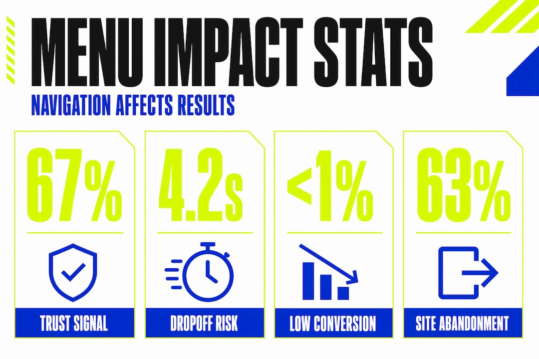
When page load times approach 4.2 seconds, conversion rates fall below 1% and 63% of users abandon the site. Navigation menu complexity directly contributes to load time. Bloated JavaScript-driven mega menus, unoptimised icon sets, and poorly structured HTML all add weight. The fix often starts in the navigation, not the homepage hero image.
Trust is another measurable factor. 67% of users identify clear contact information in navigation as a primary trust indicator. For local service businesses and professional firms especially, this is not optional. If your phone number or a “Contact us” link is buried three clicks deep, you are actively reducing the number of visitors who feel confident enough to enquire.
Then there is the perception problem with ageing designs. 60% of users cite outdated menus as a reason they perceive a site to be lower quality. Your navigation is one of the first elements visitors notice, and a menu that looks like it was built in 2014 signals that the business may not be keeping up.
“Your navigation menu is not a utility. It is a statement about how much you respect your user’s time.”
The connection to branding is also worth examining. A website audit often reveals that outdated or confusing navigation is the single biggest contributor to high bounce rates. Not the content. Not the imagery. The navigation. That is how much it matters.
Improving navigation in your current projects
Whether you are working on a new build or auditing an existing site, the path to better navigation follows a clear sequence.
- Audit your current structure. Map every top-level item and its children. Ask whether each label reflects what users are seeking, not what your organisation calls it internally. Tools like heatmaps and session recordings reveal where users actually click.
- Check your semantic markup. Open your source code and confirm you are using
<nav>,<ul>, and<li>correctly. Remove any ARIA roles that your JavaScript does not fully support. - Test keyboard navigation end-to-end. Tab through your entire menu without touching a mouse. Every item must be reachable and activatable. If you get stuck, your users will too.
- Assess mobile behaviour. Resize your browser and test on actual devices. Confirm that touch targets meet the minimum 44×44 pixel recommendation and that dropdown submenus open on tap rather than hover.
- Measure performance impact. Use tools that profile your navigation’s contribution to total page weight. Replace JavaScript-driven interactions with CSS alternatives where possible.
Pro Tip: Ask someone unfamiliar with your site to find a specific piece of content using only the navigation. If they hesitate for more than three seconds, you have a structural problem, not a labelling problem.
A full website design review should always include navigation as a priority, not an afterthought.
My perspective on navigation menus in 2026
In my experience working across branding and web design projects, navigation menus are the most consistently underestimated element on any site. Clients rarely ask about them in a brief. Developers often treat them as a template component to be populated quickly and moved on from. That is a mistake.
What I have found is that the teams who get navigation right are the ones who treat it as a product feature, not a design task. They test it with users, they audit it after launches, and they revisit it as the site grows. The sites that perform consistently well over time almost always have navigation that is clear, fast, and built on solid semantic foundations.
The accessibility side is where I see the most avoidable errors. Misused ARIA roles, hover-only triggers, and menus that collapse on mobile but never reopen correctly. These are not obscure edge cases. They affect real users every day.
The technical architecture question matters more as teams scale. I have seen development teams waste significant time untangling hard-coded navigation files. A modular registry approach takes longer to set up initially, but it pays back that investment within weeks on any project of meaningful size.
My honest take: treat your navigation as seriously as your homepage design. They deserve equal attention.
— Kukoo
How Kukoocreative can help you get it right
Your navigation menu shapes how visitors feel about your brand within seconds. At Kukoocreative, we have spent over a decade helping business owners build websites that make the right impression from the very first click.
Whether you need a full redesign or a focused UX review, we bring design thinking and technical understanding together. Our web design portfolio includes projects where clear, accessible navigation directly improved enquiry rates and user engagement for UK businesses. We also offer a structured web design process that covers navigation architecture, branding, and performance from the ground up. If you want a website that works as hard as you do, we would love to talk. Get in touch with Kukoocreative today.
FAQ
What is the role of navigation menus in web design?
Navigation menus give users a structured way to explore a site, orient themselves within its content, and complete their goals efficiently. They directly affect trust, usability, and conversion rates.
How do navigation menus affect user trust?
Research shows that 67% of users treat clear contact information in navigation as a primary trust indicator, making menu structure a significant factor in credibility.
What are the best practices for navigation menus?
Use semantic HTML elements like <nav> and <ul>, avoid hover-only triggers, test full keyboard navigability, and build responsive layouts that work correctly on touch devices.
Should I use ARIA roles in my navigation menu?
Only use ARIA roles you can fully support with JavaScript behaviour. Applying the ARIA menu role without implementing arrow-key navigation breaks the expected experience for screen reader users.
How do navigation menus for mobile differ from desktop?
Mobile navigation must use tap-based triggers rather than hover, meet minimum touch target sizes, and present a collapsed layout that expands clearly without obscuring page content.