Over 90 percent of major British brands credit their font choices with shaping public perception. The way a business presents its words can subtly build trust or cause instant disconnect. Fonts do far more than fill space, especially for British companies aiming to spark recognition at a glance. Understanding the real influence of typography unlocks new ways to connect, leaving a lasting mark on your audience with every brand interaction.
Table of Contents
- Defining The Role Of Fonts In Branding
- Types Of Fonts And Brand Personality
- How Fonts Influence Emotional Perception
- Common Pitfalls With Branding Fonts
- Ensuring Consistency Across Brand Materials
Key Takeaways
| Point | Details |
|---|---|
| Fonts as Brand Identity | Fonts are vital in conveying a brand’s personality and values, influencing customer perception and connection. |
| Strategic Font Selection | Choosing the right typeface impacts brand recognition and visual consistency across materials. |
| Emotional Impact of Typography | Different font styles evoke specific emotional responses, shaping audience perceptions subconsciously. |
| Consistency is Key | Maintaining typographic consistency across platforms enhances brand recognition and establishes a unified visual language. |
Defining the Role of Fonts in Branding
Fonts are far more than simple text characters – they are powerful visual communicators that silently speak volumes about a business’s personality and values. Typography is the sophisticated art of arranging type to create legible, readable, and visually compelling communication that extends well beyond mere letterforms.
Every font carries its own unique personality, capable of evoking specific emotional responses from audiences. Serif fonts might communicate tradition and reliability, while sans-serif typefaces often signal modernity and simplicity. The strategic selection of typography can dramatically influence how potential customers perceive and connect with a brand. Fonts serve as a fundamental component of visual identity in graphic design, transforming written language into a nuanced form of non-verbal communication.
Businesses must recognise that font selection is not merely an aesthetic choice, but a critical branding strategy. A carefully chosen typeface can establish brand recognition, create visual consistency across marketing materials, and communicate core brand values without uttering a single word. The wrong font, conversely, can undermine professional credibility and create visual confusion that distances potential customers.
Pro Business Typography Tip: Invest time in selecting fonts that genuinely reflect your brand’s core personality – consider working with a professional designer who can help you navigate the subtle but powerful world of typographic communication.
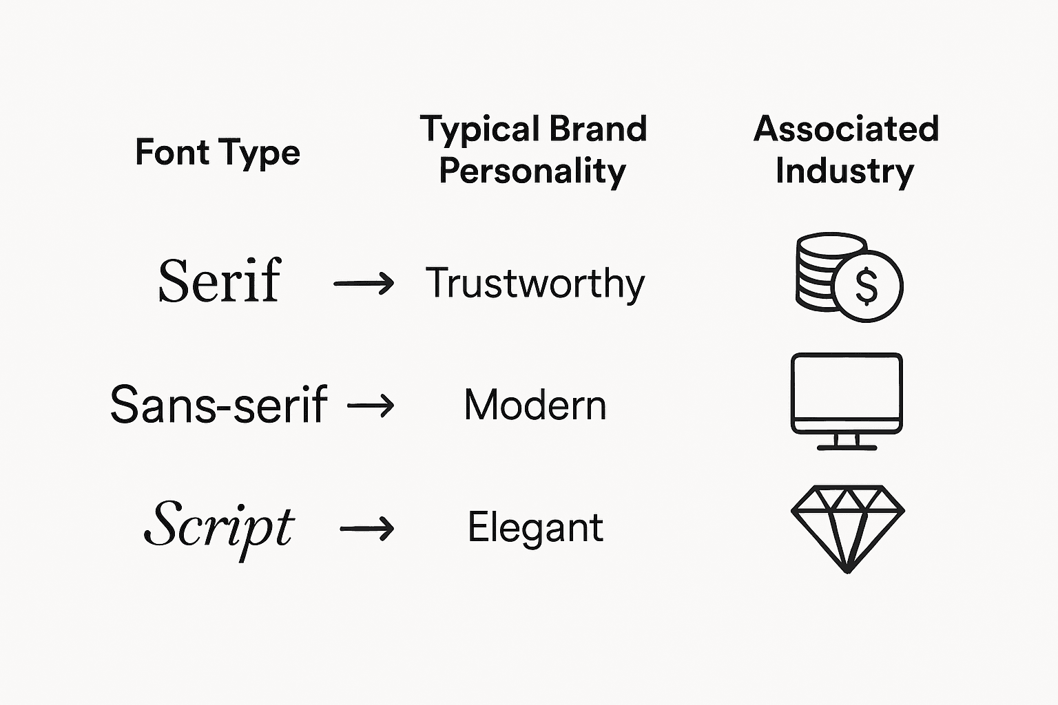
Types of Fonts and Brand Personality
Fonts are not merely decorative elements, but powerful communicators of brand identity across different industries. Research reveals distinct typography patterns in various professional sectors, demonstrating how font selection strategically signals a company’s core personality and values.
In the financial sector, sans-serif typefaces dominate, communicating professionalism and clarity. Technology companies similarly leverage modern, clean typefaces that suggest innovation and efficiency. Creative industries like food and fashion use more nuanced typography strategies – script fonts might convey approachability in food branding, while elegant serif or sans-serif fonts communicate sophistication in fashion contexts.

Understanding font personalities goes beyond aesthetic preference. Empirical studies suggest fonts can be systematically associated with specific personality traits depending on their design family. Serif fonts often communicate tradition and reliability, sans-serif fonts signal contemporary approaches, while script fonts suggest creativity and informality.
The typography a business selects is a critical non-verbal communication tool, capable of instantly communicating complex emotional and professional signals to potential customers. Thoughtful font selection can create immediate connections or establish professional distance, depending on brand strategy.
Pro Typography Selection Tip: Conduct audience research and test multiple font options to understand how different typefaces resonate with your specific target market before making a final branding decision.
Here is a summary of common font types and the brand personalities they convey:
| Font Type | Typical Brand Personality | Common Industries |
|---|---|---|
| Serif | Traditional, reliable | Finance, Publishing, Legal |
| Sans-serif | Modern, clean, approachable | Technology, Start-ups, Retail |
| Script | Creative, informal, friendly | Food, Hospitality, Creative Agencies |
| Display | Bold, distinctive, innovative | Fashion, Entertainment, Advertising |
How Fonts Influence Emotional Perception
Emotional connections are fundamental to brand communication, and typography serves as a subtle yet powerful psychological trigger that can instantaneously shape audience perceptions. Consistent visual branding helps businesses establish emotional connections by leveraging the nuanced emotional language of typography.
Different font styles evoke distinct emotional responses. Rounded, soft fonts can communicate warmth and approachability, while angular, sharp typefaces might suggest precision and intensity. Handwritten or script fonts often convey intimacy and personal touch, whereas bold, blocky fonts can communicate strength and confidence. These emotional signals operate at a subconscious level, influencing how potential customers perceive and interact with a brand before they’ve even read a single word.
The psychological impact of typography extends beyond simple aesthetic preferences. Each font carries inherent emotional weight that can dramatically shift brand perception. A healthcare provider using a playful, childlike font might unintentionally undermine their professional credibility, while a technology startup using an overly formal serif font could appear outdated and disconnected from contemporary innovation. Successful brands carefully select fonts that align with their core emotional narrative and target audience expectations.
Understanding the emotional landscape of typography requires deep empathy with your audience and a nuanced approach to visual communication. The right font can transform abstract brand values into tangible emotional experiences that resonate deeply with potential customers.
Pro Emotional Branding Tip: Conduct focus group testing with different font options to understand the subtle emotional responses they trigger in your specific target demographic.
Common Pitfalls with Branding Fonts
Font selection is a minefield of potential branding mistakes that can undermine a company’s professional image. Establishing robust brand guidelines becomes crucial in navigating these typographic challenges and avoiding costly visual communication errors.
One of the most frequent pitfalls businesses encounter is inconsistent font usage across different platforms. A website might feature a sleek, modern typeface, while marketing materials use a completely different font family, creating visual dissonance that confuses potential customers. This lack of typographic coherence fragments brand identity and reduces visual recognition. Small businesses are particularly vulnerable, often rotating through multiple fonts without understanding the importance of consistent visual language.
Another significant error is selecting fonts without considering readability and accessibility. Designers sometimes prioritise aesthetic appeal over practical communication, choosing ornate or overly stylised typefaces that become challenging to read across different devices and screen sizes. A font that looks striking on a desktop computer might become illegible on a smartphone, potentially alienating a significant portion of your audience. Professional brands must balance visual personality with functional clarity.
Many businesses also make the critical mistake of overcrowding their visual identity with too many font variations. While diversity can seem appealing, most successful brand guidelines recommend limiting font usage to two or three complementary typefaces – typically a primary font for headlines, a secondary font for body text, and potentially an accent font for special elements. This restrained approach ensures visual consistency and prevents graphic chaos.
Pro Typography Management Tip: Develop a comprehensive font style guide that specifies exact font families, weights, and usage rules to maintain consistent brand communication across all platforms.
Ensuring Consistency Across Brand Materials
Consistent typography helps establish brand recognition by creating a unified visual language that speaks directly to audience expectations. This consistency transforms disconnected design elements into a cohesive brand narrative that resonates across multiple platforms and communication channels.
Achieving typographic consistency requires a strategic approach that goes beyond simply selecting attractive fonts. Businesses must develop comprehensive style guidelines that specify precise font usage rules, including exact font families, weights, sizes, and acceptable variations. These guidelines should cover every potential touchpoint – from digital platforms like websites and social media to print materials such as business cards, brochures, and signage. Each application must maintain a recognisable visual DNA that instantly connects back to the core brand identity.
The most successful brands understand that consistency is not about rigid uniformity, but about creating a flexible yet recognisable visual system. This means selecting typefaces that can adapt across different contexts while maintaining their fundamental character. A well-designed font family, for instance, might include multiple weights and styles that allow for creative variation while preserving an overarching visual coherence. Implementing a consistent typographic approach reinforces brand recognition by creating a memorable visual signature that customers can instantly identify.
Technological considerations also play a crucial role in maintaining typographic consistency. With businesses operating across multiple digital and physical platforms, font selection must account for readability and performance across different devices, screen sizes, and printing techniques. This requires careful testing and potentially selecting versatile font families that maintain their integrity whether displayed on a massive billboard or a smartphone screen.
Pro Consistency Tip: Create a detailed brand typography document that includes specific usage instructions, acceptable font variations, and visual examples to guide all design and communication efforts.
Consider the following key factors when assessing font choices for your brand:
| Assessment Factor | Why It Matters | Example Consideration |
|---|---|---|
| Readability | Ensures clear communication | Is the font legible on all devices? |
| Consistency | Builds strong brand recognition | Is the font used uniformly everywhere? |
| Emotional Fit | Aligns font with brand values | Does it evoke the intended emotion? |
| Technical Flexibility | Works across print and digital media | Does the font render well everywhere? |
Elevate Your Brand with Expert Typography Choices
Choosing the right fonts is more than a design decision it is a strategic move that shapes your business identity and emotional connection with your audience. If you find yourself struggling with inconsistent font usage or unsure how to align typography with your brand personality you are not alone. Many businesses face the challenge of communicating clearly and memorably while balancing readability and emotional impact.
At KUKOO Creative we understand these pain points and offer tailored branding solutions that ensure your typography reflects your core values while maintaining visual coherence across all platforms. From selecting the perfect typeface to developing a comprehensive style guide we help you avoid common pitfalls and create a consistent brand narrative that resonates.
Discover how our expertise in brand design can transform your visual identity and connect you with the people who matter most.

Ready to harness the subtle power of fonts that speak volumes about your brand Get in touch with us at KUKOO Creative today and start building a distinctive, emotionally engaging brand identity that leaves a lasting impression.
Frequently Asked Questions
What role do fonts play in branding?
Fonts serve as powerful visual communicators, expressing a business’s personality and values. The choice of typography can significantly influence audience perception and brand recognition.
How do different font types influence brand personality?
Different font types convey distinct personalities; for example, serif fonts imply tradition and reliability, while sans-serif fonts suggest modernity and cleanliness. Understanding these associations helps companies align their typography with their brand identity.
Why is emotional perception important in font selection?
Typography can trigger emotional responses in audiences, impacting their perception of a brand. The right font can convey feelings like warmth, professionalism, or creativity, which are vital for establishing a strong emotional connection with customers.
What are common pitfalls in font selection for branding?
Common pitfalls include inconsistent font usage across platforms, prioritising aesthetic appeal over readability, and overcrowding visuals with too many font variations. These mistakes can confuse audiences and weaken brand identity.